Designing Dashboards and Scorecards using SharePoint PerformancePoint Services 2010 and SSAS – Part 2
Posted by: Pravinkumar Dabade ,
on 2/15/2011,
in
Category SharePoint
Abstract: In the first part of this series Designing Dashboards and Scorecards using SharePoint PerformancePoint Services 2010 and SSAS – Part 1 we saw how to create a SharePoint Site and Scorecard with KPIs. In this article we are going to see how to create a Chart Report and a Grid Report using SQL Server Analysis Services (SSAS) data source.
In the first part of this series Designing Dashboards and Scorecards using SharePoint PerformancePoint Services 2010 and SSAS – Part 1 we saw how to create a SharePoint Site and Scorecard with KPIs. If you have not read the first part, I highly recommend you to go through it before continuing with this article.
In this article we are going to see how to create a Chart Report and a Grid Report using SQL Server Analysis Services data source.
Let’s create two reports to present our data in Chart as well as Grid format.
Chart Report
Step 1: Right click PerformancePoint Content > New > Report and choose ‘Analytic Chart’ from ‘Select a Report Template’ as shown below:

Select a Data Source PDW which we created in the first article of this series. Rename your report as ‘PDW Chart Report’. The report view will look similar to the one shown below :
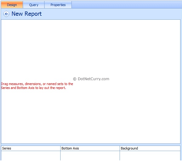
Now from the ‘Details’ window on your right hand side screen, drag and drop ‘Last 12 Cal Months Sales w/Sales’ from ‘Named Sets’ to the ‘Bottom Axis’ section of our Chart Report. Now drag and drop Product ‘Family’ from Product Dimension to the ‘Series’ section of our Chart Report as shown below:
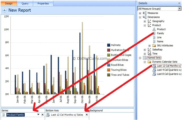
Now if you observe carefully, the report is showing all the products. But we have selected only three products. So let’s select our three products to show the Chart view. To do so, click on the drop arrow of Product Family and make a choice of our three products and ‘Update’ the report by going to the ‘Edit’ ribbon.
Now the last step is to render our chart report using Line Chart. For this, go to ‘Edit’ ribbon and click on ‘Line Chart’ from ‘Report Type’ as shown below:
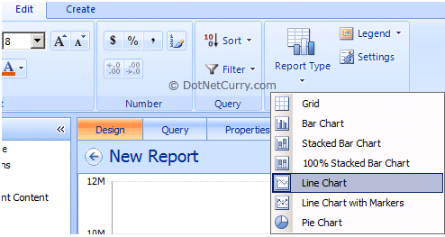
That’s all. Your Chart Report is ready.
Grid Report
Now let’s create a Grid Report :
Step 2: Right click to PerformancePoint Content > New > Report and choose ‘Analytic Grid’ from ‘Select a Report Template’ as shown below:

Select the same Data Source PDW which we created in the first article of this series. Rename your report to ‘PDW Grid Report’. The report view will look like this:
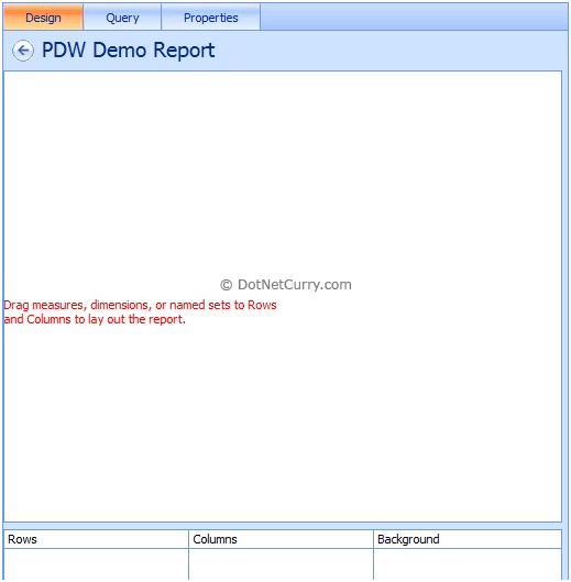
Now from the ‘Details’ Window on your right hand side, drag and drop ‘Quarter’ from ‘Time Dimension’ to the ‘Columns’ section of our Grid Report. Now drag and drop ‘City’ from ‘Geography Dimension’ to the ‘Rows’ section and Product ‘Family’ from Product Dimension to the ‘Rows’ section of our Grid Report as shown below:
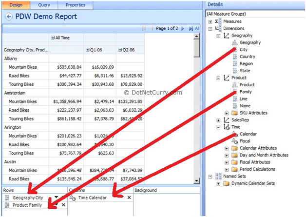
Once you are done with the above step, now let’s modify our grid report as per our requirement. To do this, let’s follow the following steps:
1) Click the drop arrow of Time Calendar from Columns sections and then choose year 2006. From year 2006, let’s make a choice of Q1 and Q2 quarter.
2) Click the drop arrow of Product Family from Rows Section and choose our three products which we would like to add to our report.
Now, let’s go to ‘Edit’ ribbon and click on ‘Update’ button.
That’s all. Your Grid Report is ready.
Conclusion
In this article we have seen how to create Analytic Chart and Grid Report using SharePoint PerformancePoint Services Dashboard Designer Tool. For this demonstration we used Microsoft Multidimensional Data Source that is SQL Server Analysis Services (SSAS) Database.
This article has been editorially reviewed by Suprotim Agarwal.
C# and .NET have been around for a very long time, but their constant growth means there’s always more to learn.
We at DotNetCurry are very excited to announce The Absolutely Awesome Book on C# and .NET. This is a 500 pages concise technical eBook available in PDF, ePub (iPad), and Mobi (Kindle).
Organized around concepts, this Book aims to provide a concise, yet solid foundation in C# and .NET, covering C# 6.0, C# 7.0 and .NET Core, with chapters on the latest .NET Core 3.0, .NET Standard and C# 8.0 (final release) too. Use these concepts to deepen your existing knowledge of C# and .NET, to have a solid grasp of the latest in C# and .NET OR to crack your next .NET Interview.
Click here to Explore the Table of Contents or Download Sample Chapters!
Was this article worth reading? Share it with fellow developers too. Thanks!
Pravinkumar, works as a freelance trainer and consultant on Microsoft Technologies. He is having over 10 years of experience in IT and is also a Microsoft Certified Trainer(MCT). He has conducted various corporate trainings on all versions of .NET Technologies including .NET, SharePoint Server, Microsoft SQL Server, Silverlight, ASP.NET, Microsoft PerformancePoint Server 2007 (Monitoring). He is passionate about learning new technologies from Microsoft. You can contact Pravinkumar at dabade[dot]pravinkumar [attherate] gmail[dot]com