In this article we will create a dashboard with common filters using Sharepoint PerformacePoint services 2010 and SQL Server Analysis Services (SSAS) Data Source. This Dashboard will contain a Chart Report and Grid Report and will contain common filter for both the Reports. Finally, both the reports will render with our filter choice(s).
So, let’s get started by creating a SharePoint Site using a Template Business Intelligence Center. Click on the Start button and go to SharePoint 2010 Central Administrator tool as shown here:

This action will open a web site. From this website click on “Create site Collections” from “Application Management” group as shown below:

This will open a Create site Page. From this page, choose a web application under which you want to create a Site collection. Once you choose a Web Application, give the title to your site collection and choose a URL. Optionally you can write a site description as shown below :

Now select a site template from Enterprise Group:

And at the end, provide your site collection administrator primary account with “Domain\Administrator”. Check the domain account and click OK.

This will create a site collection.

Now click the link and you will see your Business Intelligence center site as shown below:

Once your site is ready, browse the site and mouse hover on the Create Dashboard in the right hand section. You will see the following links

Click on the link “Start using PerformancePoint Services”. This link will take you to a page from where you can download a Dashboard Designer Tool by clicking a button “Run Dashboard Designer”.

This will download a Dashboard Designer tool at your client side. This is a Click Once Application. This tool now will help you to design the Data Sources, KPIs, Scorecards, Reports, Filters and Dashboards. The tool is shown below:

In the left hand section, you will see a Workspace Browser. In this window, you will see two settings –
1) Data Connections
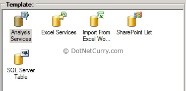
a. This is used for creating a connection with different types of data sources as shown below

b. For our demonstration, we are going to use a multidimensional Data Source that is Analysis Services.
2) PerformancePoint Content
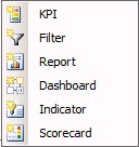
a. Using PerformancePoint Content we can design KPIs, Filters, Reports, Dashboards, Indicators and Scorecards as shown below :

For our demonstration, we are going to design two Reports (Chart Report and Grid Report), Filters and a Dashboard.
For this demonstration, I am using a Pro-clarity Data warehouse database which is a demo database provided by Microsoft. This database was given by Microsoft when Microsoft PerformancePoint Server 2007 was released in year 2007.
Download the Database over here
Restore the backup of the database with your Analysis Services. Now let’s create a data connection for our PDW database in our Dashboard Designer tool.
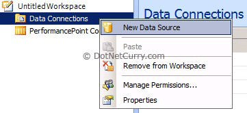
Right click Data Connection > Click New Data Source as shown here:

From Select a Data Source Template window, make a choice of Analysis Services and configure your PDW database as shown here:

Once you configure the connection to your Analysis Services and Database PDW, choose a cube “Sales” and then click “Test Data Source” button. You should get a connection Successful window.
Rename this data source to “PDW”.
Create a Chart Report from the PDW Data source
Next step is to create our Chart report from the PDW data source. For creating this report follow these steps:
Step 1: Right click PerformancePoint Content > New > Report and make a choice of “Analytic Chart” from “Select a Report Template” window as shown here:

Step 2: Select a Data Source PDW which we have created a short while ago. Rename your report to “PDW Chart Report”. The report view will look similar to the following:

Step 3: Now from the “Details” Window on your right hand side, drag and drop “Last 12 Cal Months Sales w/Sales” from “Named Sets” to the “Bottom Axis” section of our Chart Report. Now drag and drop Product “Family” from Product Dimension to “Series” of our Chart Report as shown below:

Step 4: Now your basic chart report is ready. Let’s make a choice of specific products by clicking the dropdown arrow and select products – “Mountain Bikes”, “Road Bikes” and “Touring Bikes”.
Step 5: Now let’s add Parameters to our chart report. To add the parameters to our chart report click on “Query” tab of your report as shown below :

This will show you a MDX query. Select “[Product].[Family].&[4]” from the query. In the Parameter’s section write a parameter name “ChartProduct1” and click on “Insert” button.
Repeat the above step for “[Product].[Family].&[5]” and “[Product].[Family].&[6]” to add Parameters “ChartProduct2” and “ChartProduct3” respectively.
You should have a screen that looks similar to the following:

Create a Grid Report from the PDW Data source
Now let’s create a Grid report. To create a Grid report, let’s follow these steps:
Step 1: Right click PerformancePoint Content > New > Report and make a choice of “Analytic Grid” from “Select a Report Template” as shown below:

Step 2: Select a Data Source PDW which we created a short while ago. Rename your report to “PDW Grid Report”. The report view will look similar to the following:

Step 3: Now from the “Details” Window on your right hand side, drag and drop “Quarter” from “Time Dimension and Calendar Attribute” to the “Columns” section of our Grid Report and make a choice of “Q1-06” and “Q2-06”. Now drag and drop “City” from “Geography Dimension” to the “Rows” section and Product “Family” from Product Dimension to the “Rows” section of our Grid Report and make a choice of products – “Mountain Bikes”, “Road Bikes” and “Touring Bikes” as shown below:

Step 4: Now you are ready with a basic Grid Report. Let’s add parameters to this Grid report. To do so, click on the “Query” tab.
This will show you a MDX query. Select “[Product].[Family].&[4]” from the query. In the Parameter’s section write a parameter name “GridProduct1” and click on “Insert” button.
Repeat the above step for “[Product].[Family].&[5]” and “[Product].[Family].&[6]” to add Parameters “GridProduct2” and “GridProduct3” respectively.
You should have a screen that looks similar to the following:

That’s all. Your reports are ready with parameters.
Designing Filters for Dashboard
Now let’s design our “Filters” which we can use on our Dashboard. To do this, follow these steps:
Step 1: Right Click PerformancePoint Content > New > Filter. This will show you a popup window “Select a Filter Template”. From there, select “Member Selection” as shown below:

Click the OK button. You will now see a wizard. From this wizard, first select our data source “PDW” and click the “Next” button. The next step is where you will select a “Filter Dimension” and “Filter Members”
Step 2: For the “Filter Dimension” click a button “Select Dimension”. It will show you all the dimensions. From that list, select a dimension “Product.Family”. Now click on “Select Members” button and select all the products one by one.
Click next and keep the default settings as it is. Finish the wizard. Now rename your filter to “Product1” name.
Repeat the above step twice and add two more filters with the name “Product2” and “Product3”.
Step 3: Now our filters are ready. Let’s create a Dashboard which will consolidate our reports (Chart and Grid) and filters which we have created above.
Right click PerformancePoint Content > New > Dashboard which will use a Dashboard template “Header – Two Columns” as shown below:

Rename your Dashboard with “PDW Filter Dashboard”. Your Dashboard will look similar to the one shown below:

Step 4: Now right click the “Header” and click “Split Zone”. This will split Header zone in two sections. Now right click Zone1 and again click “Split Zone”. Now your dashboard will look similar to the following:

Step 5: Now let’s add our Chart Report into Left Column of our Dashboard and Grid Report to Right Column of our Dashboard. We will also add our Filters Product1, Product2, Product3 in Header, Zone1, Zone2 sections respectively as shown below:

Mapping Filters to Chart Report Parameters
Now you have placed the reports and filters to appropriate positions as per our requirement. Let’s map the filters “Product1”, “Product2”, “Product3” to our chart report parameters “ChartProduct1”, “ChartProduct2”, “ChartProduct3”. To do this let’s follow below steps:
First drop down your “Product1” filter and drag and drop “Member Unique Name” to the “Drop Fields to Create Connections” section of our “Analytic Chart Report” as shown below:

This will show you a popup window “Connection”. From that window, select your Parameter “ChartProduct1” and from “Connect To” dropdown list “Member Unique Name”.
Repeat the above steps for filters “Product2” and “Product3”.
Repeat this procedure for your Grid Report as well.
Your dashboard should now look similar to the one shown here:

Now Save your dashboard and deploy it to SharePoint Site. You will see the filters on top of your dashboard. Change the filters and see that both the reports are rendering the data as per your filter choice.
Here’s how your Dashboard will look on a SharePoint Site:

That’s all! You have successfully created a Dashboard with Common Filters and deployed it to SharePoint Site.
Conclusion
In this article, we have seen how to create a SharePoint Dashboard using filters. We have also seen how to apply these filters commonly to all the reports which we are consolidating in our Dashboard. For this demonstration, we have used Microsoft Multidimensional Data Source that is SQL Server Analysis Services(SSAS) Database.
This article has been editorially reviewed by Suprotim Agarwal.
C# and .NET have been around for a very long time, but their constant growth means there’s always more to learn.
We at DotNetCurry are very excited to announce The Absolutely Awesome Book on C# and .NET. This is a 500 pages concise technical eBook available in PDF, ePub (iPad), and Mobi (Kindle).
Organized around concepts, this Book aims to provide a concise, yet solid foundation in C# and .NET, covering C# 6.0, C# 7.0 and .NET Core, with chapters on the latest .NET Core 3.0, .NET Standard and C# 8.0 (final release) too. Use these concepts to deepen your existing knowledge of C# and .NET, to have a solid grasp of the latest in C# and .NET OR to crack your next .NET Interview.
Click here to Explore the Table of Contents or Download Sample Chapters!
Was this article worth reading? Share it with fellow developers too. Thanks!
Pravinkumar, works as a freelance trainer and consultant on Microsoft Technologies. He is having over 10 years of experience in IT and is also a Microsoft Certified Trainer(MCT). He has conducted various corporate trainings on all versions of .NET Technologies including .NET, SharePoint Server, Microsoft SQL Server, Silverlight, ASP.NET, Microsoft PerformancePoint Server 2007 (Monitoring). He is passionate about learning new technologies from Microsoft. You can contact Pravinkumar at dabade[dot]pravinkumar [attherate] gmail[dot]com