The recently released ASP.NET MVC 4 beta has enhanced mobile support through the introduction of new APIs and out of box support for jQuery Mobile. The Mobile web project template helps you develop targeted mobile web applications ground up.
MVC 4 also has a new 'View Switching' functionality that helps adding Mobile capabilities to an existing site in a very clean way. In this article, we will see how we can take an existing MVC 4 application that is built for the desktop browser only and add mobile views to it.
Download the non-mobile site's code from here and follow along to make it mobile enabled.
Starting off
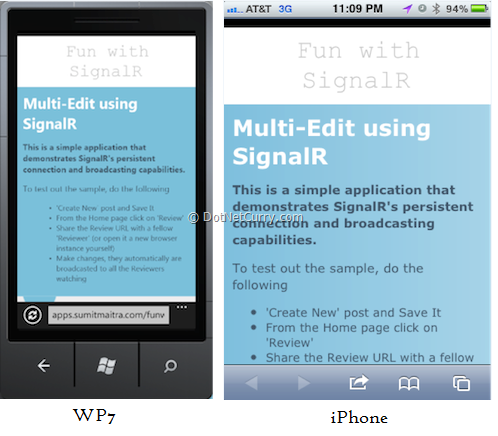
If we run the code now in a mobile browser, we will see the following Home page. As we can see, this is just a 're-arranged' version of the desktop site. The following meta tag (in _Layout.cshtml) helps scale things to the smaller view port of the mobile device.
<meta name="viewport" content="width=device-width" />

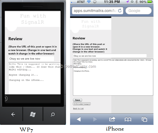
If we navigate to the 'Review' or 'Edit' pages, we will see due to the styles applied to the text area, the mobile views are warped. WP7 (Mango) emulator's IE and an iPhone's Safari render the 'Review' page as follows. Thus, dynamic views using CSS can only go so far.

Bringing in jQuery Mobile
Nuget has two packages for jQuery mobile
-
jQuery.mobile - Pulls in only the jQuery Mobile js and css dependencies.
-
jQuery.Mobile.MVC - Pulls in all jQuery.mobile and MVC4 goodies like adding the ViewSwitcherController, adding the _Layout.mobile.cshtml
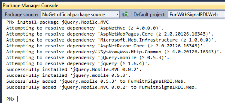
Through the Package Manager Console let's install jQuery.Mobile.MVC. The following dependencies should get installed.

Patching a minor gotcha
Once you install jQuery mobile, since all the JavaScript's get downloaded in the Scripts folder due to the bundling and minification setup by default (in _layout.cshtml), the jquery.mobile behavior will kick in for certain components like buttons and text boxes in non-mobile sites too.

To fix this, we simply create a Mobile folder under Scripts folder and move the mobile related js into it.

Similarly for Content folder, create a mobile sub-folder and move the mobile related classes in it. Also copy the Content/images into Content/mobile/images.

Now open the _Layout.mobile.cshtml and change the references to point to the correct 'mobile' folder.

Getting the View Switcher in Action
With the mobile references in place, let's run the app and refresh our Mobile view. We will see a slightly different view. The original CSS has been stripped and we have a little heading that tells us that currently the Mobile View is being shown and we could toggle back to 'Desktop View' if we wanted. However rest of the page is pretty messed up.

Clicking on Desktop view at this point will throw an error saying ViewSwitcher controller not found. This is not the fault of MVC. It's our code that bombed. Remember we have a custom controller factory that creates Controllers as required. We have not added the ViewSwitcher controller in the BlogControllerFactory class.

With that piece of code in place, we can now switch between Desktop and Mobile views, except that the mobile view looks tad worse than the Desktop view.
Adding Mobile specific Views
To introduce specific mobile views that are custom made for mobile screens, MVC4 allows you to add views with a custom display mode by appending '.displaymode' to a view. We take advantage of this by adding Index.mobile view for the Index page. The '.mobile' display mode comes by default with the jQuery.Mobile.MVC package. Later we will see how we can target different mobile browsers differently.
We use the standard MVC scaffold tooling to generate a 'List' type view for our BlogPost model class.

Now when we view the application instead of the modified desktop view, we get a custom Mobile view.

If you click on the 'Desktop View', you will see the original desktop view which is also available at the same URL on your desktop browser.
Recap
Let's do a quick recap here, because what we've got here is the crux of mobile support in MVC.
And just like that we now can have two different views for the exact same Action or URL.
Under the Covers
The MVC4 infrastructure has under the covers done quite a bit of work for us here. There is a new DisplayModeProvider that by default ships with two modes, desktop and mobile. For desktop it checks browser agent information to see if the browser is on a mobile device or desktop device. To pick up the mobile view it checks if a corresponding .mobile view exists and if it does, uses that view.
Unless you want to add your custom views the DisplayModeProvider stays out of the picture. We will see a sample of how to use DisplayModeProvider a little later. For now let's deep dive into jQuery mobile techniques to make our mobile views more attractive.
Enabling switching from Desktop to Mobile view on Desktop Browser
Now if you visit the application from the desktop browser you will not see a switch to mobile view link because no one really wants to see the mobile view on a desktop browser. But it is an awfully handy thing to do when debugging. To enable the view switcher in Desktop browser, open _ViewSwitcher.cshtml and in the first line’s if(…) condition, remove ‘Request.Browser.IsMobileDevice &&’. If we remove this we will see the view switcher in desktop browser as well.
Using jQuery.mobile
Since mobile views usually have lesser screen-space showing a table/grid layout isn't usually an effective presentation layout. Instead, we keep things at a minimal and try to get users to navigate in small steps.
For our home screen instead of showing Details, Edit, Review, Delete for each row we let user navigate to a 'Details' page where there will be additional controls to do the Edit, Review and Delete. The markup for the Index.mobile.cshtml is thus reduced to the following.

Understanding the Markup
- The '@section header'
The '@section header' markup encapsulates a section that is designated as the 'header' tag in HTML5.
- <h1>@ViewBag.Title</h1>
Shows the title of the page.
- <div data-role="button" data-icon="plus" class="ui-btn-right">
This is the line where we first encounter jquery mobile custom attributes. Here 'data-role' is an attribute that indicates to jQuery how the content in the container should be rendered. 'data-icon' is an attribute that defines the icon to use on the button. The various types of icons are defined here. Through all our walkthrough we will see various custom attributes that add meta information that helps jquery render the UI.
The section in this div gets rendered as a button to the right of the header.
- <div data-role="content">
This section indicates to jQuery.mobile that this div is the container for content
- <ul data-role="listview">
The data-role="listview" indicates that jquery should apply special rendering for the list.
- <li data-role="list-divider">Current Posts</li>
The first list time has the data-role of a list-divider. This makes the list item un-clickable and it gives it different visual cues.
- Using razor sytax we add the rest of the posts. To keep things short, we only show the post.Title property.
Now when we browse to the Index page on a mobile browser the page looks as follows

As we see above this is a standard and easy on eyes view that provides a clean way to invoke the 'Create' action (header button) and the 'Details' action (list item). Next we create a Details.mobile.cshtml to create the mobile view.
Adding a Mobile Details View
When the user clicks or taps on the list items we take them to a details page where they see the entire post and can do Edit/Delete/Review if required.
We start off with a standard MVC view called Details.mobile.cshtml
We then modify the markup to give it a 'mobile' look.
The final markup looks as follows:

- The header section has the data_icon attribute set to arrow-l (arrow left) and the data_rel attribute set to back. This means the button will mimic the browser back button and also the button is to the left of the header.
- The content section is standard
- I have used a List view here though we don't really have a list, I just used the list-divider rendering to give the post title a different look from the post content.
- <pre style="white-space: pre-line">
This tag encapsulates the post content while maintaining the linefeeds.
- Button Rendering
We have three buttons for three different actions. Each with a built-in icon.
The final UI looks as follows on a mobile browser

Now arguably that's not the best mobile UI by far, however we get an idea of how jQuery mobile helps us build a Mobile specific page.
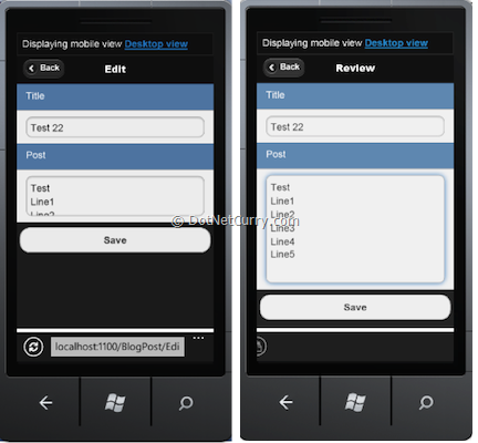
Using similar markup we create the Review, Edit and Delete pages and when done they looks as follows:


Adding a view specifically for a Device
So far we have seen how we can add views that simply go by whether the browser is on a Mobile or Desktop device. What if we want to handle different devices separately; For example target WP7 separate from iOS? This is where we get DisplayModeProvider in the play.
We have to register a new DisplayMode in the Global.asax. To register the mode we have to give it a name and provide a condition that will help determine the device that we are targeting.
Let us say we want to add a special mode for iPhones only. The following code registers the new display mode

We are providing a lambda expression that checks the HttpContext's User Agent for the term iPhone, through do a case insensitive search. If the condition is satisfied the DisplayProvider will look for a view that ends with iphone.cshtml. Note we are inserting it at position 0 of all the modes so, this condition is evaluated first. If this condition fails the generic 'mobile' view kicks in which falls through to the generic view.
Adding an iPhone View
Just to test it out, we will add a Index view for the iphone that has two lines per list instead of the one line per list we have here.
Add a new Index view with the name Index.iphone.cshtml. The following markup adds two lines for each Post in the application.

There is nothing new from a markup perspective except that for each line item has two lines, one wrapped as header and another as a paragraph.
When we publish this code, it looks as follows on the iPhone:

The same page on Windows Phone (emulator) looks as follows

The same page on IE9 looks as follows

The best part is SignalR works across ALL these browsers. Isn't that cool?
Conclusion
We saw how we can use jQuery.Mobile.MVC package, that is a part of MVC4, leverages jQuery.mobile and HTML5 to create targeted views for each device. Best part is the routing is transparent so all devices are actually looking at the same URL.
We should use mobile views because
-
It helps us tailor views to specific devices
-
It helps reduce bandwidth usage over mobile devices by giving us option to remove un-necessary graphics from Mobile views.
-
Gives us the ability to build UI much closer to native mobile devices in look and behavior.
The only major ‘con’ of this approach is initial increase in effort for new views, however this is mostly mitigated in the long run because maintaining separate views usually means lesser ‘cross-platform’ hacks hence cleaner and easier to maintain markup.
With ASP.NET MVC 4, we are really looking at a very powerful framework that enables you to develop rich web applications for any target device (and audience).
The entire source code of this article can be downloaded over here
This article has been editorially reviewed by Suprotim Agarwal.
C# and .NET have been around for a very long time, but their constant growth means there’s always more to learn.
We at DotNetCurry are very excited to announce The Absolutely Awesome Book on C# and .NET. This is a 500 pages concise technical eBook available in PDF, ePub (iPad), and Mobi (Kindle).
Organized around concepts, this Book aims to provide a concise, yet solid foundation in C# and .NET, covering C# 6.0, C# 7.0 and .NET Core, with chapters on the latest .NET Core 3.0, .NET Standard and C# 8.0 (final release) too. Use these concepts to deepen your existing knowledge of C# and .NET, to have a solid grasp of the latest in C# and .NET OR to crack your next .NET Interview.
Click here to Explore the Table of Contents or Download Sample Chapters!
Was this article worth reading? Share it with fellow developers too. Thanks!
Sumit is a .NET consultant and has been working on Microsoft Technologies since his college days. He edits, he codes and he manages content when at work. C# is his first love, but he is often seen flirting with Java and Objective C. You can follow him on twitter at @
sumitkm or email him at sumitkm [at] gmail