Previously in one of the articles written by Sumit, we saw how we could build an ASP.NET MVC Mobile site using the Mobile Site Template. This is a good start for Greenfield projects. However, if you already have an existing ASP.NET MVC Site and you would like to add seamless transition between Mobile and Non-Mobile views, you can easily accomplish it with the help of the built in Mvc.Mobile package.
This article has been co-authored with Sumit Maitra
Getting Started
To start off with, I have created a simple ASP.NET MVC application to ‘simulate’ an existing application. It is a simple Address Book application that stores, Name, Street, Address, State, Country, PostalCode and Date of Birth.
The following is a collage of the various desktop views for the Contact controller.

Responsive Design and Mobile Views
As we saw above, the application uses the default ASP.NET MVC Template. This template uses responsive design techniques using the viewport meta-tag to pick up appropriate CSS styles. The view-port is specified in _Layout.cshtml. It essentially sets the device-width reported by the browser as the width of the content frame.

Using the CSS Media queries in the Site.css, the browser switches UI based on the width of the device

As we can see above, the Media query defines a set of CSS style for width up to 850 pixels. Any width lesser than 850px is considered a mobile view in the default CSS.
With the Responsive Design in place, if we look at the site on a Mobile device, this is how it looks

Except for the Index page, the rest are usable but they look out of place or retro-fitted.
Adding First Class Mobile Support using jQuery Mobile
Now that we’ve seen the limitations for Responsive CSS, let’s explore dedicated Mobile Views and the special MVC ViewSwitcher.
- From Package Manager Console, install the jQuery.Mobile.Mvc package as follows
PM> install-package jQuery.Mobile.MVC
- This installs a host of things including jQuery Mobile UI Themes, a new Configuration file called BundleMobileConfig, a new Controller called ViewSwitcherController, an empty Context file called AddingMobileSupportToMVCContext, _Layout.Mobile.cshtml and _ViewSwitcher.cshtml. Let’s look at each in some details.

BundleMobileConfig.cs
This class adds creates the Bundles for jQuery Mobile styles
public class BundleMobileConfig
{
public static void RegisterBundles(BundleCollection bundles)
{
bundles.Add(new ScriptBundle("~/bundles/jquerymobile")
.Include("~/Scripts/jquery.mobile-{version}.js"));
bundles.Add(new StyleBundle("~/Content/Mobile/css")
.Include("~/Content/Site.Mobile.css"));
bundles.Add(new StyleBundle("~/Content/jquerymobile/css")
.Include("~/Content/jquery.mobile-{version}.css"));
}
}
To include these bundles, we must register it in Global.asax
protected void Application_Start()
{
AreaRegistration.RegisterAllAreas();
WebApiConfig.Register(GlobalConfiguration.Configuration);
FilterConfig.RegisterGlobalFilters(GlobalFilters.Filters);
RouteConfig.RegisterRoutes(RouteTable.Routes);
BundleConfig.RegisterBundles(BundleTable.Bundles);
// Add Mobile Bundles
BundleMobileConfig.RegisterBundles(BundleTable.Bundles);
AuthConfig.RegisterAuth();
}
_ViewSwitcher.cshtml and the ViewSwitcherController.cs
@if (Request.Browser.IsMobileDevice && Request.HttpMethod == "GET")
{
<div class="view-switcher ui-bar-a">
@if (ViewContext.HttpContext.GetOverriddenBrowser().IsMobileDevice)
{
@: Displaying mobile view
@Html.ActionLink("Desktop view", "SwitchView", "ViewSwitcher", new { mobile = false, returnUrl = Request.Url.PathAndQuery }, new { rel = "external" })
}
else
{
@: Displaying desktop view
@Html.ActionLink("Mobile view", "SwitchView", "ViewSwitcher", new { mobile = true,
returnUrl = Request.Url.PathAndQuery }, new { rel = "external" })
}
</div>
}
The _ViewSwitcher.cshtml checks if the browser is Mobile browser or not and generates an appropriate link to switch views. ViewSwitcherController uses the value passed to it when user clicks on the View Switcher link and switches to the appropriate view. We’ll see what we mean by Appropriate View in the next section.
_Layout.Mobile.cshtml
As we saw, this partial view was added when we added the jQuery Mobile package. The .Mobile convention is baked into MVC and when the GetOverriddenBrowser().IsMobileDevice returns true, MVC goes and checks for .Mobile.cshtml files and starts rendering them as available. So if you only have the _Layout.Mobile.cshtml and no Index.Mobile.cshtml in your view folder, MVC will fall back on the standard Index.cshtml view while using the _Layout.Mobile.cshtml as the default layout.
This is a VERY powerful mechanism we’ve got here.
It’s worth noting .Mobile is not hardcoded, rather the default. We can have .WP7, .WP8, .Iphone, .Android or any such specially targeted views as we deem required.
With the ViewSwitcher and _Layout.Mobile.cshtml in place, now if we run the application, the Home page and Edit page look as follows. Note only the underlying _Layout page has changed to _Layout.Mobile. No new views have been introduced.

Adding Mobile Views and Using jQuery
Time has come to exploit our jQuery UI skills which Sumit taught us in his last article. Let’s first add an Index.Mobile.cshtml. The following markup is enough to layout minimal information for the Index.
@model IEnumerable<AddingMobileSupportToMVC.Models.Contact>
@{
Layout = "~/Views/Shared/_Layout.Mobile.cshtml";
ViewBag.Title = "Contacts";
}
@section Header{
<div data-role="button" data-icon="plus" class="ui-btn-right">
@Html.ActionLink("New", "Create")
</div>
}
<ul data-role="listview" data-inset="true">
<li data-role="list-divider"></li>
@foreach (var item in Model)
{
<li>
<a href="Contact/Details/@item.Id">
<h3>
@item.Name
</h3>
</a>
</li>
}
</ul>
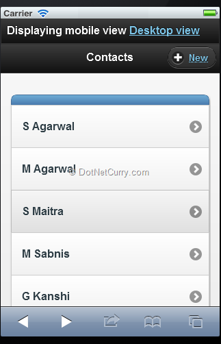
When we run the app in the Simulator, we see the view rendered as

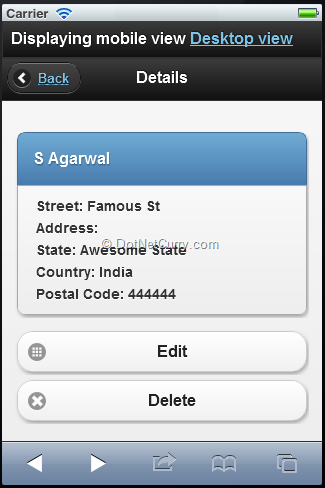
This looks like a neat Mobile view and tapping on any of the names in the list navigates to the details view. Let’s add a Details View now. We add a new Details.Layout.cshtml to the View\Contact folder and mark it up as follows
@model AddingMobileSupportToMVC.Models.Contact
@{
Layout = "~/Views/Shared/_Layout.Mobile.cshtml";
ViewBag.Title = "Details";
}
@section Header{
<div data-role="button" data-icon="arrow-l" data-rel="back" class="ui-btn-left">
@Html.ActionLink("Back", "Back")
</div>
}
<ul data-role="listview" data-inset="true">
<li data-role="list-divider">
<h2>@Model.Name</h2>
</li>
<li>
<div style="padding: 3px">Street: @Model.Street</div>
<div style="padding: 3px">Address: @Model.Address</div>
<div style="padding: 3px">State: @Model.State</div>
<div style="padding: 3px">Country: @Model.Country</div>
<div style="padding: 3px">Postal Code: @Model.PostalCode</div>
/li>
</ul>
@using (Html.BeginForm("Edit", "Contact", new { id = Model.Id }, System.Web.Mvc.FormMethod.Get))
{
<button id="edit" name="edit" data-role="button" data-icon="grid">Edit</button>
}
@using (Html.BeginForm("Delete", "Contact", new { id = Model.Id }, System.Web.Mvc.FormMethod.Get))
{
<button id="delete" name="delete" data-role="button" data-icon="delete">Delete</button>
}

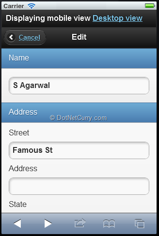
As we can see, our mobile views are coming along nicely. We now need to polish off the Edit view to have a nice looking mobile application.
The Edit markup for the Edit.Mobile.cshtml is as follows
@model AddingMobileSupportToMVC.Models.Contact
@{
Layout = "~/Views/Shared/_Layout.Mobile.cshtml";
ViewBag.Title = "Details";
}
@section Header{
<div data-role="button" data-icon="arrow-l" data-rel="back" class="ui-btn-left">
@Html.ActionLink("Cancel", "Index")
</div>
}
@using (Html.BeginForm())
{
@Html.AntiForgeryToken()
@Html.ValidationSummary(true)
<ul data-role="listview" data-inset="false">
<li data-role="list-divider">@Html.LabelFor(model => model.Name)</li>
<li>
<div class="editor-field">
@Html.EditorFor(model => model.Name)
@Html.ValidationMessageFor(model => model.Name)
</div>
</li>
<li data-role="list-divider">@Html.LabelFor(model => model.Address)</li>
<li>
@Html.LabelFor(model => model.Street)
<div class="editor-field">
@Html.EditorFor(model => model.Street)
@Html.ValidationMessageFor(model => model.Street)
</div>
@Html.LabelFor(model => model.Address)
<div class="editor-field">
@Html.EditorFor(model => model.Address)
@Html.ValidationMessageFor(model => model.Address)
</div>
@Html.LabelFor(model => model.State)
<div class="editor-field">
@Html.EditorFor(model => model.State)
@Html.ValidationMessageFor(model => model.State)
</div>
@Html.LabelFor(model => model.Country)
<div class="editor-field">
@Html.EditorFor(model => model.Country)
@Html.ValidationMessageFor(model => model.Country)
</div>
@Html.LabelFor(model => model.PostalCode)
<div class="editor-field">
@Html.EditorFor(model => model.PostalCode)
@Html.ValidationMessageFor(model => model.PostalCode)
</div>
@Html.LabelFor(model => model.DateOfBirth)
<div class="editor-field">
@Html.EditorFor(model => model.DateOfBirth)
@Html.ValidationMessageFor(model => model.DateOfBirth)
</div>
</li>
</ul>
<input type="submit" value="Save" id="edit" name="edit" data-role="button" data-icon="grid" />
}

Now that we’ve got the views in place we know that .Mobile.cshtml extensions are automatically picked up for Mobile browsers.
Targeting Browsers
MVC’s mobile web site support actually enables device specific targeting of views as well. In addition to .Mobile.cshtml, we could have .Iphone.cshtml and .WP8.cshtml etc. targeting specific devices. However differentiation of devices is left to the user and it is plugged in as follows:
DisplayModeProvider.Instance.Modes.Insert(0,
new DefaultDisplayMode("wp75")
{
ContextCondition = (context =>
(context.Request.UserAgent.IndexOf("Windows Phone OS 7.5", StringComparison.OrdinalIgnoreCase)
>= 0))
});
This basically adds a Display Provider that looks out for views with the wp75.cshtml extensions. These views are applied when the ContextCondition is met. The condition here is that the Browser’s UserAgent contains “Windows Phone OS 7.5”.
To test, we first view the Index page on Windows Phone 7.5 first (I am spoofing browser agents in Firefox actually). We see a view similar to the Mobile view.

Next we add a _Layout.wp75.cshtml, copy the content of the _Layout.Mobile.cshtml and change the ‘data-theme’ from ‘c’ to ‘a’ and refresh the page. Similarly we copy Index.Mobile.cshtml as Index.wp75.cshtml and update the ViewBag.Title to be ‘Contacts WP7.5’.
Now when we refresh the page, the view changes as follows:

As we can see the WP7.5 browser is using its own view. We can navigate back to the page using iPhone and it would continue to use the old layout.
Conclusion
That concludes the demo of adding Mobile Support to an existing MVC web-site. Remember, the ViewSwitcher is optional, just display provider and different views will suffice. The ViewSwitcher simply helps users switch between mobile and desktop views on the Mobile device itself.
Download the entire source code of this article (Github)
This article has been editorially reviewed by Suprotim Agarwal.
C# and .NET have been around for a very long time, but their constant growth means there’s always more to learn.
We at DotNetCurry are very excited to announce The Absolutely Awesome Book on C# and .NET. This is a 500 pages concise technical eBook available in PDF, ePub (iPad), and Mobi (Kindle).
Organized around concepts, this Book aims to provide a concise, yet solid foundation in C# and .NET, covering C# 6.0, C# 7.0 and .NET Core, with chapters on the latest .NET Core 3.0, .NET Standard and C# 8.0 (final release) too. Use these concepts to deepen your existing knowledge of C# and .NET, to have a solid grasp of the latest in C# and .NET OR to crack your next .NET Interview.
Click here to Explore the Table of Contents or Download Sample Chapters!
Was this article worth reading? Share it with fellow developers too. Thanks!
Suprotim Agarwal, MCSD, MCAD, MCDBA, MCSE, is the founder of
DotNetCurry,
DNC Magazine for Developers,
SQLServerCurry and
DevCurry. He has also authored a couple of books
51 Recipes using jQuery with ASP.NET Controls and
The Absolutely Awesome jQuery CookBook.
Suprotim has received the prestigious Microsoft MVP award for Sixteen consecutive years. In a professional capacity, he is the CEO of A2Z Knowledge Visuals Pvt Ltd, a digital group that offers Digital Marketing and Branding services to businesses, both in a start-up and enterprise environment.
Get in touch with him on Twitter @suprotimagarwal or at LinkedIn