SharePoint Server 2013 BI - Interactive Reports using Power View in Excel 2013
Posted by: Pravinkumar Dabade ,
on 1/11/2013,
in
Category SharePoint
Abstract: In this article, we will see how easy it is to design interactive and beautiful reports using Excel 2013 Power View with Filters. We will also uploaded the report into our SharePoint 2013 site and display it in our browsers.
In this article, we will see how to build beautiful and interactive reports using “Power View” in Microsoft Excel 2013. Later we will use these reports in SharePoint 2013. For this demonstration, I am going to use the “AdventureWorks” SQL Server Database which can be downloaded for free over here.
Open Excel 2013 and create a new “Blank workbook”. Once the workbook is ready, we will use a power pivot data source for designing Power View reports. Although Power Pivot by default is available in Excel 2013, however it is not enabled. To enable the Power Pivot Add-In, follow these steps.
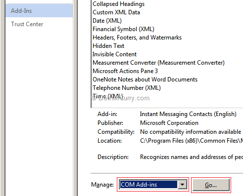
In Excel, go to File > Options. This opens “Excel Options”. Click on Add-Ins > Under “Manage” dropdown box, choose “COM Add-Ins” > click on the “Go” button as shown below
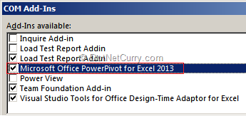
Excel will display the “COM Add-Ins” window. Choose “Microsoft Office PowerPivot for Excel 2013” and click “OK” as shown below –
Once you enable the Power Pivot Add-In, you will see a tab in Excel 2013. If you click this “POWERPIVOT” tab, you will see the following options –

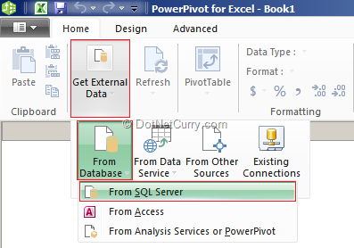
Let’s get the data from Microsoft SQL Server Database. To get the data from SQL Server, click on the “Manage” button which is shown in the above diagram. This brings up the “PowerPivot for Excel” window. Click on “Get External Data” button. Then choose “From Database” and then “From SQL Server” as shown below –
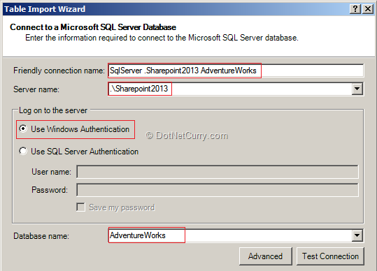
Now provide your SQL Server instance name, use windows authentication and select database “AdventureWorks” as shown below –
Click on the “Next” button. In the next window of the wizard, you will be asked whether you want to select the tables and views or you want to write a query. We will make a choice of selecting the tables and views for importing the data. Click on the “Next” button and to view all the tables and views in the next step of our wizard. Now choose “SalesOrderHeader” and click on “Select Related Tables” button. This will select 10 tables.
Now click on “Finish” button to import the selected tables and then close the wizard. This step will create a separate sheet for each table, along with the data.
You can perform different operations here. For example you can add your own columns. In the tool bar of the “Home” tab, click on “Diagram View” as shown below –

This shows you a database diagram view for the selected tables with the relationships. If you want, you can add your own relationship as shown below –
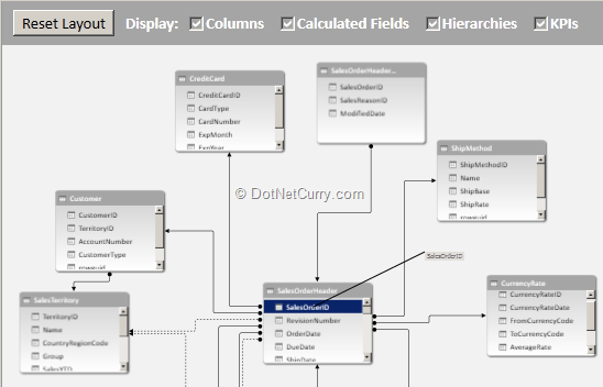
Actually we don’t require all the above tables. So you can delete all the other tables except “Sales Territory”. Now let’s go back to “Data View”. Close the “PowerPivot for Excel window”. You are now on our main Excel sheet where we will be designing the report.
Designing a Report using Excel 2013 Power View
To design the report, go to the “Insert” tab and click on “Power View”. If you are using “Power View” for the first time, it will ask you to enable the Power view add-in as shown below –

Click on “Enable” button to bring up the “Power View Report Designer”. On the left hand section, you will see the report designer and a filter section. On the right hand section, you can see all the tables with the fields. In our case, we have only one table that is “Sales Territory”.
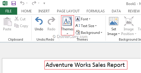
Now let’s first name our report as “Adventure Works Sales Report” and apply the “Theme” by choosing the “Themes” dropdown list as shown below –
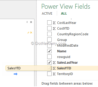
From the “Power View Fields” section, choose the “Sales Territory” table and drag and drop “SalesYTD” field on our report view in the left hand side section as shown below –
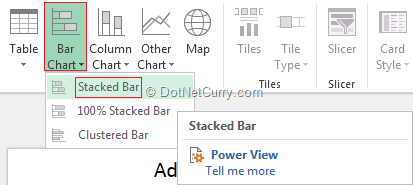
The default view is set to “Table” for the Power View report. Click on “Bar Chart” and choose “Stacked Bar” as shown below –
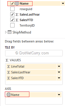
Now drag and drop “SalesLastYear” from “Sales Territory” table and drop it on our stacked chart. After this step, drag and drop “Name” field from “Sales Territory” table in the “AXIS” section of our “Power View Fields” as shown below –
Now adjust the height and width of your chart and your chart will look similar to the following –
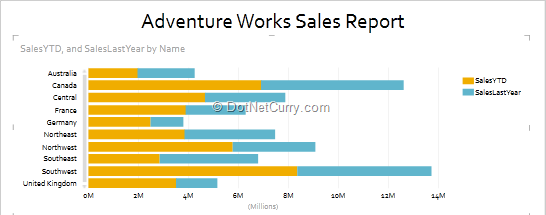
Now let’s add a filter. To add a filter, drag and drop a “Name” field from the “Sales Territory” table into “Filters” section. If you choose specific sales territory, your chart will get reflected as per your territory choice. We have now finished designing the “Stacked Bar” chart report.
Let’s beautify this report.
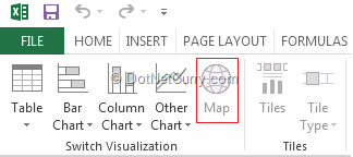
For this, we will drag and drop a “Name” field from “Sales Territory” table below our stacked bar chart. Then click on “Map” from the toolbar section as shown below –
Now drag and drop “SalesYTD” from “Sales Territory” into “Size” section which you can find under “Power View Fields”. Also drag and drop the “Name” from “Sales Territory” into “Locations” section of “Power View Fields”.
Now your report should look similar to the following –

Pretty Cool! Your report is ready with a geographical map and stacked chart bar. You can also apply the filters from the “Filters” section. Now save the document with the name “AdventureWorksSalesReport”.
Deploying the Report to SharePoint Server
Let’s deploy this report to our SharePoint Server. I am using Office 365 SharePoint Developer site for uploading the Excel 2013 workbook which we just designed sometime back. Before uploading the documents to your SharePoint site, you must follow some rules –
- Your excel workbook size must be less than 10 MB.
- To display reports in SharePoint site, you must have the Silverlight plug-in installed.
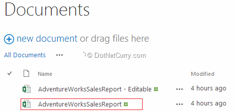
I have uploaded the “AdventureWorksSalesReport.xlsx” into my “Documents” library as shown below –
Now click on the excel workbook. The workbook will get displayed in browser as shown below –
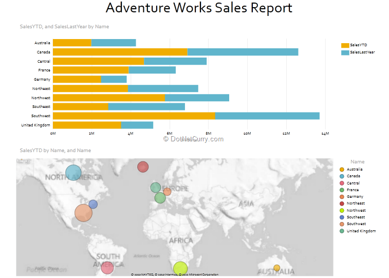
You can now try filtering the data. Also try clicking on the Bar chart or click on the Bubble of any region, and the filter will automatically get applied on both “Stacked Chart” as well as the Map report.
Conclusion
In this article, we have seen how easy it is to design interactive and beautiful reports using Excel 2013 Power View with Filters. We also uploaded the report into our SharePoint site and displayed it in our browsers.
This article has been editorially reviewed by Suprotim Agarwal.
C# and .NET have been around for a very long time, but their constant growth means there’s always more to learn.
We at DotNetCurry are very excited to announce The Absolutely Awesome Book on C# and .NET. This is a 500 pages concise technical eBook available in PDF, ePub (iPad), and Mobi (Kindle).
Organized around concepts, this Book aims to provide a concise, yet solid foundation in C# and .NET, covering C# 6.0, C# 7.0 and .NET Core, with chapters on the latest .NET Core 3.0, .NET Standard and C# 8.0 (final release) too. Use these concepts to deepen your existing knowledge of C# and .NET, to have a solid grasp of the latest in C# and .NET OR to crack your next .NET Interview.
Click here to Explore the Table of Contents or Download Sample Chapters!
Was this article worth reading? Share it with fellow developers too. Thanks!
Pravinkumar, works as a freelance trainer and consultant on Microsoft Technologies. He is having over 10 years of experience in IT and is also a Microsoft Certified Trainer(MCT). He has conducted various corporate trainings on all versions of .NET Technologies including .NET, SharePoint Server, Microsoft SQL Server, Silverlight, ASP.NET, Microsoft PerformancePoint Server 2007 (Monitoring). He is passionate about learning new technologies from Microsoft. You can contact Pravinkumar at dabade[dot]pravinkumar [attherate] gmail[dot]com