In my previous article, I introduced some SharePoint Server 2013 and PerformancePoint Services Enhancements. We will continue our series and explore how to create and apply cascading filters in Performance Point Services dashboard. Please note that this feature is available with SharePoint Server 2010 SP1 and SharePoint Server 2013. We will implement this feature using SharePoint Server 2013.
For this demonstration, I am using –
- Windows Server 2012.
- Microsoft SharePoint Server 2013.
- Microsoft SQL Server Analysis Services 2012.
First of all, we will create a SharePoint site using a SharePoint template called “Business Intelligence Center” as shown below –

Specify the user name and create the site.
Now it’s time to design the dashboard. For designing the dashboard, we need a dashboard designer. Earlier in SharePoint Server 2010, the dashboard designer was launched on a button click. But now the dashboard designer can be launched through the ribbon. To launch the dashboard designer, click on “Settings” and “View Site Contents”. Once you are on the “Site Contents” page, click on Dashboards library. Go to “PERFORMANCEPOINT” ribbon and click on “Dashboard Designer” as shown below –

This will launch the Dashboard Designer tool -

For this demonstration, I am using Analysis Services database which is “PDW” – “ProClarity Data Warehouse”. The first step is to create a “Data Connection”. Right click “Data Connections” and click on “New Data Source” context menu. It will show you different types of data sources. Choose “Multidimensional” and “Analysis Services”. Click the “OK” button.
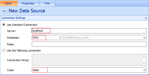
Now specify the connection string. Also specify appropriate Server Name, Database Name and Cube name as shown below –
Rename the data source to “PDW” and save the data source. Now let’s add a new “Analytic Chart” report. Right click “PerformancePoint Contents”, New and Report. This will show you the different report templates as shown below –

As soon as you create an “Analytic Chart” report, it asks you which data source you would like to use. Choose the PDW data source and click the “Finish” button. Rename the report as “PDW Chart Report”.
Now from the “Details” pane which is on our right hand side, drag and drop “Last 12 Cal Months w/Sales” into our “Bottom Axis” section and drag and drop “Family”, “Country”, “Region” and “City” from Geography and Product dimension into a Series section as shown below –
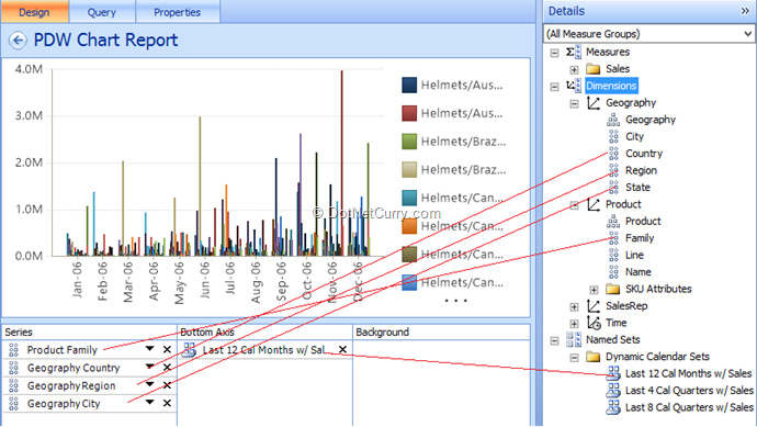
Now your chart report is ready.
Let’s add one more new report, which is “Analytic Grid” report with the name “PDW Grid Report”. Drag and drop “Quarter” from time dimension into Columns and drag and drop “Geography Country”, “Geography Region”, “Geography City” from Geography and “Product Family” Product dimensions respectively into Rows section as shown below –
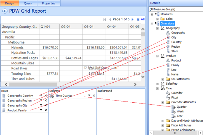
Now your grid report is ready.
Adding Parameters to Reports
Let’s add Parameters to our both the reports. To add Parameters, first open your “PDW Chart Report” in design mode. Click on the Query tab as shown below –
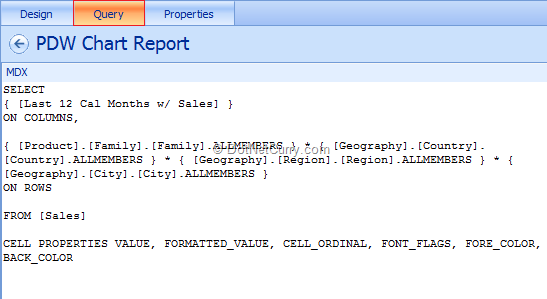
This will show you a MDX query. From the MDX query, select [Geography]. [Country]. [Country].ALLMEMBERS and in the Parameters section at the bottom, give a parameter name as “ChartCountry” and click on Insert button. Repeat this procedure for Region and City with the parameter name “ChartRegion” and “ChartCity”.
Now open the “PDW Grid Report” and click on the “Query” tab. Let’s add the parameters “GridCountry”, “GridRegion” and “GridCity” for Country, Region and City respectively.
Now let’s add Filters. To add the filters, right click on “PerformancePoint Content” and click on add New Filter as shown below –
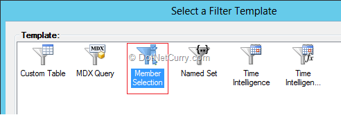
Make a choice of “Member Selection” as shown above and click on the “OK” button. Choose the “PDW” data source and click on the “Next” button. In a Select Member step, choose filter dimension “Geography. Country”. In Filter Members, choose few countries as per your choice. In Select Display Method step, choose “List”. Rename the filter with the name “Country”. Repeat this procedure to add “Region” and “City” filter. Make a choice of appropriate Regions as well as Cities as per your country choices.
Now it’s time to create a Dashboard and deploy the same to our SharePoint site. To create a Dashboard, right click “PerformancePoint Contents” and click on New > “Dashboard”. Make a choice of “Header and 2 Columns” dashboard page template. Rename your dashboard to “PDW Dashboard”. Also rename Page to “PDW Chart and Grid Report”.
Split the Header zone, into 3-sections. Now your dashboard should look like the following –

From the “Details” pane, expand the Filters section. Drag and drop the filters “Country”, “Region” and “City” in Header, Zone 1 and Zone 2 sections respectively. Now expand “Reports” section from the “Details” pane and then PerformancePoint Contents. Drag and drop “PDW Chart Report” into our bottom left column and “PDW Grid Report” into bottom right column.
Now to apply the cascading behavior, expand the Country filter and then drag and drop “Member Unique Name” on Region filter as shown below –
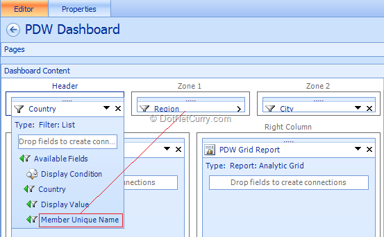
Repeat the same for Region. Expand the Region filter from the Zone 1 and drag and drop “Member Unique Name” on City filter which is located into Zone 2. This procedure will provide a cascading behavior to our filters.
Now let’s join the Filters to our reports as well. Let’s drag and drop “Member Unique Name” from Country filter on our report which will create a connection to map the filter value to our “ChartCountry” parameter. Repeat this procedure for Region filter as well as City filter.
Repeat the above procedure to map our filters to the PDW Grid report as well.
Save the dashboard and deploy it to our SharePoint site. To deploy the dashboard to SharePoint site, right click “PDW Dashboard” and click on “Deploy to SharePoint”. It asks you for the master page settings. Use the “Default Site Master Page” and click “OK” button.
Your final report will look like below –

Conclusion
In this article we have see how to create and apply cascading filters in Performance Point Services dashboard.
This article has been editorially reviewed by Suprotim Agarwal.
C# and .NET have been around for a very long time, but their constant growth means there’s always more to learn.
We at DotNetCurry are very excited to announce The Absolutely Awesome Book on C# and .NET. This is a 500 pages concise technical eBook available in PDF, ePub (iPad), and Mobi (Kindle).
Organized around concepts, this Book aims to provide a concise, yet solid foundation in C# and .NET, covering C# 6.0, C# 7.0 and .NET Core, with chapters on the latest .NET Core 3.0, .NET Standard and C# 8.0 (final release) too. Use these concepts to deepen your existing knowledge of C# and .NET, to have a solid grasp of the latest in C# and .NET OR to crack your next .NET Interview.
Click here to Explore the Table of Contents or Download Sample Chapters!
Was this article worth reading? Share it with fellow developers too. Thanks!
Pravinkumar, works as a freelance trainer and consultant on Microsoft Technologies. He is having over 10 years of experience in IT and is also a Microsoft Certified Trainer(MCT). He has conducted various corporate trainings on all versions of .NET Technologies including .NET, SharePoint Server, Microsoft SQL Server, Silverlight, ASP.NET, Microsoft PerformancePoint Server 2007 (Monitoring). He is passionate about learning new technologies from Microsoft. You can contact Pravinkumar at dabade[dot]pravinkumar [attherate] gmail[dot]com