In the recently concluded //Build 2013 conference, Microsoft showcased the future of development on all Microsoft platforms and today we start a mini-series looking at some of the new stuff that came out. We start off with XAML and see what’s new in XAML for Windows 8.1 store apps. Though it’s not the official moniker, I’ll just call it XAML for Windows 8.1.
To see all that’s new, we need a Windows 8.1 Preview machine or VM and Visual Studio 2013 Ultimate Preview. I setup a VM with 60 gigs disk space and 4 Gigs of memory. Given this infrastructure, let’s jump right in..
What’s new in XAML for 8.1
New App Project Template - the Hub App
Straight off the bat as we start Visual Studio and head for a new Windows Store App Project template, we see there is a new Type called the Hub App.
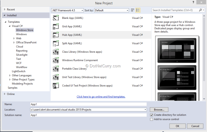
This actually deserves a write up of its own. In brief, this new app type is a template for apps similar to the Bing News reader app in Windows 8. It consists of a Big Hero image introduction page and then smaller sections of data we scroll from right to left. These sections can be further drilled down. Though a variant of the Grid App, there are optimizations built in load load data lazily as people scroll right. Also thanks to upgrades to UI Composition in 8.1, the dreaded scroll to black where if you scroll horizontally to fast the system was unable to render thumbnails and instead got a black screen scrolling by, is now resolved.
New Controls
New Visual Studio Release usually means new component goodies and 2013 Preview doesn’t disappoint. For those of us who built apps for the Store previously will remember there were basic controls like DatePickers, Flyouts etc. missing. There are a host of happy additions in this regard. Some of the new Controls released in XAML for 8.1 are as follows:
Date and Time Picker
We start off with two new ones. Finally we have fully internationalized Date and Time picker controls in XAML. Though they look like non-glamorous sets of dropdowns, anyone who’s tried to build one on their own realize how much work goes into creating an internationalized Date/Time picker.
Design Time
At design time, we can drag and drop them on the canvas and set the Date and Time properties appropriately.
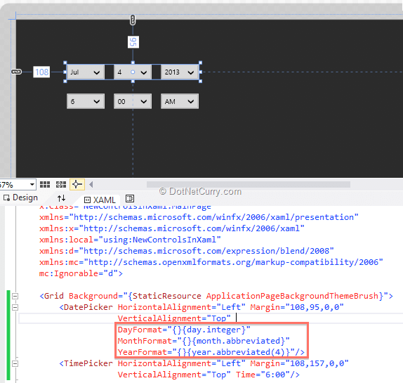
As you can see, you can specify formatting at design time and if you are wondering what are those squiggly bracket options and how many do you have to remember, well you don’t have to remember any, because Visual Studio has auto-completion for those built in.

At Run Time
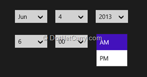
At runtime, it behaves predictably and shows the picker with the formatting selected
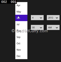
If you are wondering what the 002 and 001 is, these are framerate etc. values enabled as a part of debug build.
Flyouts
Flyouts in WinRT XAML are like popups with an auto dismiss, they can come up from Menu’s or Buttons (like context menu of yesteryears) and present you some options, that you either invoke or if you tap/click outside the flyout, dismiss the flyout itself. This implementation was not out of the box and you either need to do it yourself or depend on third party libraries like Callisto to deliver the ‘controls’ for it. XAML for 8.1 has flyouts built in now.
The Menu and Generic Flyout
The menu flyout can be attached to Buttons or AppBarButtons. On tapping/clicking the button, the Menu pops up with Menu Items and when we click on a menu item the menu goes away.
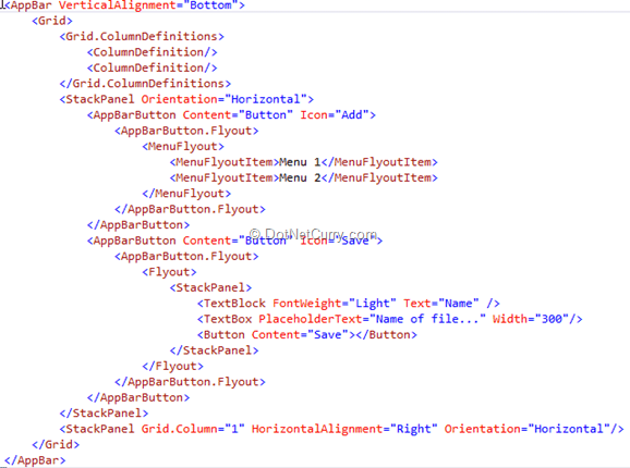
A typical use case for this is use in an AppBar. When the user right clicks or, slides in from the top or bottom of the screen, the AppBar appears with more options via AppBarButtons. Each button can further have Menu’s or other Flyouts like accepting Name etc. This is now much easier to accomplish using the Flyout control. In the sample below we have two AppBarButtons one brings up a Menu flyout and the other one brings up a Stack Panel with assorted controls.
So for the given XAML markup
We get the following UI at runtime
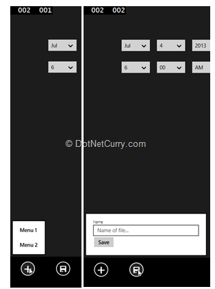
As we can see, we have added two buttons to an App Bar docked at the bottom of the application. The Add [+] button has a Menu Flyout attached to it, which has two MenuItems. Whereas the Save button has a simple flyout with a stack panel in which we have three controls a TextBlock, a TextBox and a Button.
Settings Flyout
Another ‘Control’ that the Callisto library provided was the ‘Settings Flyout’. A Screen that was integrated with the Settings charm and displayed Settings or additional options for the Application. This is now out of the box and you no longer need the Callisto library for it. Let’s see how we can use this:
1. You add a Flyout like adding a new XAML Page.

2. Add an additional Command in the OnLaunched event override in App.xaml.cs
SettingsPane.GetForCurrentView().CommandsRequested += DisplaySettingsFlyout;
3. Next add the Event handler to add a command and command action
private void DisplaySettingsFlyout(SettingsPane sender, SettingsPaneCommandsRequestedEventArgs args)
{
SettingsCommand cmd = new SettingsCommand("flyoutSample", "Flyout Sample", (x)=>
{
SettingsFlyout1 flyout = new SettingsFlyout1();
flyout.Title = "Flyout Title";
flyout.Show();
});
args.Request.ApplicationCommands.Add(cmd);
}
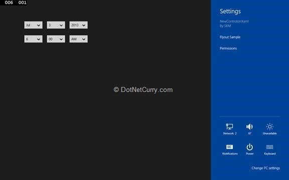
4. Now if we run the App, and bring up the Settings, we’ll see the “Flyout Sample” command item.
5. On clicking the Command Item, we get our default custom Flyout.
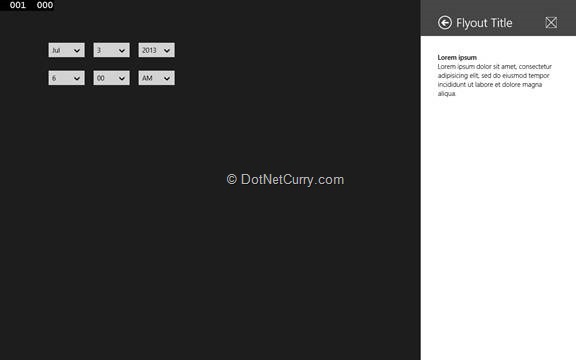
6. We can update the XAML in SettingsFlyout1.xaml to contain any settings we want, and save it as required.
Search Box
In Windows 8, the guidance for search in Store Apps was to use the Search Charm and integrate your application with it. However, there were queries raised on the search charm bringing up other potentially competing apps when a user is attempting to search using your app. This type of concern along with the launch of Bing as a platform has resulted in a new control, the Search Box.
Again, Search and Bing as a platform deserves a separate post of its own. Suffices to say here that search is no longer limited to Search charm only.
Media Control
There is a Basic Media control now that comes out of the box with simple playback, seek, volume, stretch and full screen controls.
With the following XAML markup, I can render a basic media player:
<MediaElement HorizontalAlignment="Left" Height="580"
Margin="456,95,0,0"
VerticalAlignment="Top" Width="806"
AreTransportControlsEnabled="True"
Source="assets/2-164-TimHeuer.wmv" Position="0:1:0" />

At runtime we can specify the Source as a valid URI to load media dynamically.
We can change colors etc. but other than that, the control is pretty locked down. We could of course use media primitives to build our own media player from scratch.
SwapChainPanel
Previously the SwapChainBackgrounPanel control was used for DirectX interop in XAML elements with the serious limitation that it had to be the Root element. The SwapChainPanel control allows you to put it anywhere in your control hierarchy and thus leverage DirectX more flexibly allowing you to mix and match the power of DirectX with ease of XAML.
Existing Controls Enhanced
Easier Glyphs on Buttons
If we look at the XAML for Buttons closely, there are a few more changes that make buttons easier to use.
For example in the above Menu Flyout sample we have specified Icon as follows
<AppBarButton Content="Button" Icon="Save">
…
</AppBarButton>
A more elaborate way to specify the Icon is as follows:
<AppBarButton Content="Button">
<AppBarButton.Icon>
<SymbolIcon Symbol="Add"></SymbolIcon>
</AppBarButton.Icon>
…
</AppBarButton>
The Symbol property as we can see from the screenshot below has lots of pre-defined options that are essentially defined in the Segoe UI Symbol font.

However Glyphs are not restricted to SymbolIcons only. You can have BitmapIcon with UriSource
<BitmapIcon UriSource="assets/mylogo.png"></BitmapIcon>
You could also have Custom Fonts specified via the FontIcon type
<FontIcon FontFamily="assets/myfont.ttf#Font Name" Glyph="+"></FontIcon>
Additionally we have a vector based Icon type called PathIcon to which we can provide vector data
<PathIcon Data="[path data goes here]"></PathIcon>
These seemingly obvious changes make XAML for WinRT much friendlier to use.
TextBox Enhancements
The Callisto control had implemented a Watermarked Textbox separately. XAML for 8.1 has the PlaceHolderText property built in. If you noticed above, we have already used it for the Name Textbox in the Save flyout.
<TextBox PlaceholderText="Name of file..." Width="300"/>
WebView enhancements
ZOrder
WebView earlier used to hog the z-order and stayed on top of components, for example the AppBar. This has now been rectified and WebView doesn’t hog the z-order anymore, so if you have an AppBar that’s supposed to come over the WebView, it will work correctly.
Local Rendering
WebView can now load local content complete with relative paths, javascript, media etc. So you can load a web page stored locally straight off the bat.
Lifecycle Events
WebView now has lifecycle events like NavigationStarting, NavigationFailed, NavigationCompleted, giving you better control to show/hide progress and build better integration between the WebView and your XAML app.
Hook into Content Type
You can hook in custom content type resolvers so that the WebView is unable to resolve a type you can intercept the failure and then resolve the content and send the output to the WebView once done. One example is viewing epub books, similarly you could have custom XML Magazine layouts that you could render into final HTML and present in the Web View.
RenderTargetBitmap
Earlier dumping the Control Tree into a Bitmap was not supported taking a Screen shot of the entire app or part of App was not possible. Now using the RenderTargetBitmap object, we can save a ControlTree as a bitmap.
Other Changes
This is by far not all the changes in XAML for 8.1. Most of tye other changes are around performance of XAML
XAML Binary Format: The final signed appx will no longer contain text based markup as it will get converted into Binary.
Text Improvements: Textboxes now support hyperlinks and colored fonts by default among other enhancements. There is also a new PDF rendering API.
Databindings: We now going to have Behaviors SDK so again, improved databinding support.
Theming: We can now override default themes on a per component basis. Also as a part of improved theming support. As a part of the performance improvement, only the default theme is loaded to start with.
Conclusion
There are tons more that we will cover in the near future. Some of the features we saw here deserve full articles themselves. XAML for 8.1 is definitely a huge step forward from current XAML for store apps. It should give Windows Store Apps the right boost.
Download the entire source code of this article (Github)
This article has been editorially reviewed by Suprotim Agarwal.
C# and .NET have been around for a very long time, but their constant growth means there’s always more to learn.
We at DotNetCurry are very excited to announce The Absolutely Awesome Book on C# and .NET. This is a 500 pages concise technical eBook available in PDF, ePub (iPad), and Mobi (Kindle).
Organized around concepts, this Book aims to provide a concise, yet solid foundation in C# and .NET, covering C# 6.0, C# 7.0 and .NET Core, with chapters on the latest .NET Core 3.0, .NET Standard and C# 8.0 (final release) too. Use these concepts to deepen your existing knowledge of C# and .NET, to have a solid grasp of the latest in C# and .NET OR to crack your next .NET Interview.
Click here to Explore the Table of Contents or Download Sample Chapters!
Was this article worth reading? Share it with fellow developers too. Thanks!
Sumit is a .NET consultant and has been working on Microsoft Technologies since his college days. He edits, he codes and he manages content when at work. C# is his first love, but he is often seen flirting with Java and Objective C. You can follow him on twitter at @
sumitkm or email him at sumitkm [at] gmail