A casual glance at WPF’s ItemsControl may not elicit much excitement, but behind its modest façade lies a wealth of power and flexibility. Gaining a deep understanding of the ItemsControl is crucial to your efficacy as a WPF developer. Such an understanding will enable you to recognize and rapidly solve a whole class of UI problems that would otherwise have been debilitating. This two part article will help you obtain this understanding.
As an added bonus, the knowledge you garner here will be applicable to the wider XAML ecosystem. Windows Store, Windows Phone, and Silverlight platforms all include support for ItemsControl. There may be slight differences in feature sets or usage here and there, but for the most part your knowledge will be transferrable.
In the first part of this article we covered the fundamentals of the ItemsControl. We’re now going to build on these foundations and explore more advanced topics, such as grouping and custom layouts.
This article is published from the DNC Magazine for .NET Developers and Architects. Download this magazine from here [Zip PDF] or Subscribe to this magazine for FREE and download all previous and current editions
Advanced Item Appearance Customization
An obvious visual problem with our UI so far is the lack of sufficient spacing around and between items. Of course, we could address this by adding margins to the Grid of each DataTemplate, but that would result in duplicate code and would couple our templates more tightly to a specific context. If we want to re-use those templates elsewhere, the margin we choose here may not suit the new location.
A better way to solve this is by way of the ItemContainerStyle for the ItemsControl. As the name suggests, this property allows us to provide a Style that is applied to the container for each item. But what is the container for our items? For a vanilla ItemsControl, it is a simple ContentPresenter, which we can verify by using the WPF visualizer (see Figure 1). The container used can differ depending on the specific subclass of ItemsControl we’re using, as we’ll see later. For now, note that the Style we set for ItemContainerStyle will be applied to a ContentPresenter.
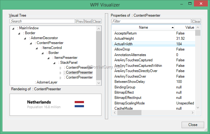
Figure 1: The container for items in a vanilla ItemsControl is a ContentPresenter
Thus, we can modify our XAML to specify a Margin for the ContentPresenter hosting each of our items:
<ItemsControl
        ItemsSource="{Binding}"
        ItemTemplateSelector="{StaticResource PlaceDataTemplateSelector}">
    <ItemsControl.ItemContainerStyle>
        <Style TargetType="ContentPresenter">
            <Setter Property="Margin" Value="6 3 6 3"/>
        </Style>
    </ItemsControl.ItemContainerStyle>
</ItemsControl>
This gives us the more aesthetically pleasing UI depicted in Figure 2. Things aren’t quite so cluttered anymore.
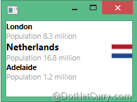
Figure 2: Using ItemContainerStyle to add some spacing around items
Just as the DataTemplate property has a corresponding DataTemplateSelector property, so too the ItemContainerStyle property has a corresponding ItemContainerStyleSelector. The mechanics of this property are exactly the same as DataTemplateSelector, so I won’t be going into the details here. The only difference is you’re returning a Style instead of a DataTemplate. In choosing the Style, you’re privy to the same information as you are when choosing a DataTemplate: the item itself, and the container for the item.
When you have many items in a list, it’s often helpful to visually distinguish one item from the next in some subtle fashion. Otherwise, in the eyes of the user, it can be hard to tell where one item ends and the next begins. Sufficient spacing is one way to achieve this, but when the volume of data is high and screen real estate is of high importance, an alternating background color from one item to the next is another common technique.
We’ve just discussed how we can dynamically choose a style by using ItemContainerStyleSelector. Would that be a viable means of achieving alternating background colors? Not really. After all, how would we know which Style to choose? Our view model would need to expose its index within the list so that we could choose one Style for even indices and another for odd indices. And what happens when we add or rearrange items in our list? Suddenly we have to invalidate a whole bunch of items in order for the UI to pick up the correct styles per item. Obviously, such an approach would be awful.
Thankfully, ItemsControl provides the AlternationCount and AlternationIndex properties to help us out of this predicament. These two properties work in tandem: AlternationCount allows us to specify how many items to count before resetting AlternationIndex back to zero, and AlternationIndex (an attached property) tells us what index a certain item container has been assigned. For example, if we set AlternationCount to 2 then the first item will have AlternationIndex 0, the second item will have AlternationIndex 1, and the third item will have AlternationIndex 0 again. Repeat ad nauseam for all items in our list. The upshot of this is that our item containers now have an AlternationIndex that we can use to trigger different visuals.
Let’s try this out. The first part is easy:
<ItemsControl
        ItemsSource="{Binding}"
        ItemTemplateSelector="{StaticResource PlaceDataTemplateSelector}"
        AlternationCount="2">
We’ve now specified an AlternationCount of 2, but how do we select a different background based on the resulting AlternationIndex of each container? The first step is to introduce a trigger into our Style:
<Style TargetType="ContentPresenter">
    <Setter Property="Margin" Value="6 3 6 3"/>

    <Style.Triggers>
        <Trigger Property="ItemsControl.AlternationIndex" Value="1">
        </Trigger>
    </Style.Triggers>
</Style>
However, we now have a problem. ContentPresenter is too primitive a control to even expose a Background property. We’ll come back to this issue shortly, but for now let’s instead modify the item’s Margin based on the AlternationIndex:
<Trigger Property="ItemsControl.AlternationIndex" Value="1">
    <Setter Property="Margin" Value="12 3 12 3"/>
</Trigger>
The result is shown in Figure 3. The first thing you’ll notice is that I’ve added some more data to make our changes easier to spot. Secondly, you’ll see that every other item is indented further than the item preceding it (both from the left and the right). Success!
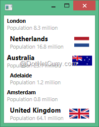
Figure 3: Using AlternationCount and AlternationIndex to affect item margins
Now, to the problem of wanting to set the Background rather than the Margin. Fundamentally, we need a different container for our items. There are ways of cobbling a solution together using ContentPresenter, but they’re essentially just hacks. A better approach is to tell our ItemsControl to use a ContentControl to house each item – that way we can modify the Background of the ContentControl. It’s worth pointing out that this is not usually necessary. It’s relatively rare to use an ItemsControl directly as opposed to one of its derived classes. The derived classes all provide richer containers for their items, and those containers will generally facilitate background color changes. But we’re going to get to derived classes later, and this is an instructive exercise besides.
ItemsControl includes a property called ItemContainerGenerator, which looks like a likely candidate for the customizations we require. Alas, this property is get-only and ItemContainerGenerator is a sealed class. Not to worry though, because we can do what other ItemsControl derivative classes do: override a method called GetContainerForItemOverride:
public sealed class CustomItemsControl : ItemsControl
{
    protected override DependencyObject GetContainerForItemOverride()
    {
        return new ContentControl();
    }
}
If we use our CustomItemsControl instead of the default ItemsControl, our items are now wrapped in a ContentControl, as per Figure 4. And you’ll notice the property list contains our old friend, Background.
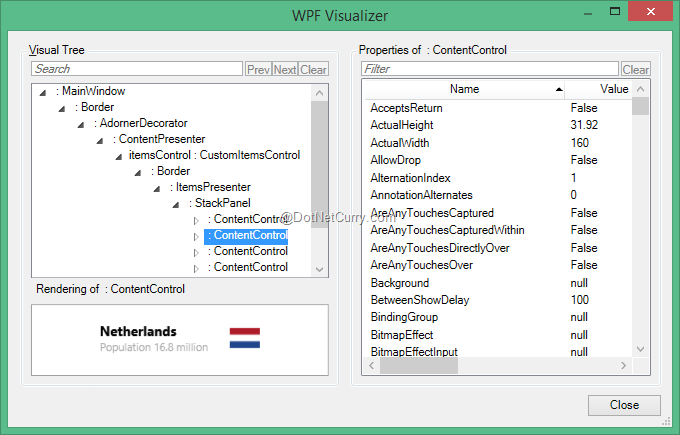
Figure 4: Our ItemsControl using ContentControl to wrap each item instead of ContentPresenter
Let’s modify our Style then:
<Trigger Property="ItemsControl.AlternationIndex" Value="1">
    <Setter Property="Background" Value="LightGray"/>
</Trigger>
Seems like all we’d need to do, right? Unfortunately, no. Even though ContentControl has a Background property, its default template does nothing with it. WPF is not making our lives easy right now! To rectify this, let’s include our own template for ContentControl:
<local:CustomItemsControl.ItemContainerStyle>
    <Style TargetType="ContentControl">
        <Setter Property="Padding" Value="6 3 6 3"/>
        <Setter Property="Template">
            <Setter.Value>
                <ControlTemplate TargetType="ContentControl">
                    <Border
                            Background="{TemplateBinding Background}"
                            Padding="{TemplateBinding Padding}">
                        <ContentPresenter/>
                    </Border>
                </ControlTemplate>
            </Setter.Value>
        </Setter>

        <Style.Triggers>
            <Trigger Property="ItemsControl.AlternationIndex" Value="1">
                <Setter Property="Background" Value="LightGray"/>
            </Trigger>
        </Style.Triggers>
    </Style>
</local:CustomItemsControl.ItemContainerStyle>
You’ll notice I’ve also set Padding on our ContentControl and changed our Margin assignment to instead modify Padding. This is to ensure that our background color shows right up to the edges of our ItemsControl, rather than being inset. The end result is shown in Figure 5.
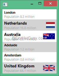
Figure 5: Our ItemsControl with alternating background colors for each item
Phew! That wasn’t quite the smooth sailing we hoped for, but it’s worth re-iterating that we’re on a lesser travelled path here. Using other controls that subclass ItemsControl will usually result in these kinds of scenarios working more smoothly.
Grouping Items
When you bind an ItemsControl to a collection as we have been thus far, things are not entirely as they seem. Behind the scenes, WPF is creating and binding to an adapter called CollectionViewSource instead of binding directly to the collection we give it. The CollectionViewSource that is created on our behalf will point to the collection we supplied. This layer of indirection provides a suitable place where grouping, sorting, and filtering of the underlying data can occur. We’re not going to be discussing sorting and filtering in this article because they’re entirely data concerns, but let’s take a look at how we can group our data.
The grouping functionality within the CollectionViewSource works in tandem with grouping properties on the ItemsControl itself. The CollectionViewSource decides how data is grouped whereas the ItemsControl decides how to render those groups.
Suppose we want to group our data by the type of place in question: all countries in one group, and all cities in another. The first thing we need to do is stop binding directly to our collection of places, and instead bind to a CollectionViewSource. There are various ways of achieving this, but we’ll do it in XAML. As a first step, let’s explicitly declare a CollectionViewSource in our Window resources:
<CollectionViewSource x:Key="places" Source="{Binding}"/>
Notice how the Source property of the CollectionViewSource is bound to our underlying data collection. Now we need to modify our ItemsSource to use this CollectionViewSource. The syntax for doing so is a little tricky:
<local:CustomItemsControl
    ItemsSource="{Binding Source={StaticResource places}}"
    …
Notice that we’re binding the ItemsSource property instead of simply assigning the CollectionViewSource directly to it. That’s because it is WPF’s binding infrastructure that recognizes the special role of CollectionViewSource and interacts with it to obtain our data. In other words, the binding infrastructure understands the indirection that CollectionViewSource provides, and it resolves this indirection on our behalf.
With those two changes in place, our UI looks exactly as per Figure 5. But now what happens if we introduce some grouping to our CollectionViewSource? To do so, we need to include one or more GroupDescription objects when creating the CollectionViewSource. Often these will be instances of PropertyGroupDescription. For example, if we were grouping by the Name property on our view models (which might make sense with a lot more data), we could do this:
<CollectionViewSource x:Key="places" Source="{Binding}">
    <CollectionViewSource.GroupDescriptions>
        <PropertyGroupDescription PropertyName="Name"/>
    </CollectionViewSource.GroupDescriptions>
</CollectionViewSource>
Then items with the same name will appear together (that is, if we had any with the same name). But this approach doesn’t help us in this scenario because we want to group by the type of place, and we have no appropriate property that gives us that information. Sure, we could add such a property, but we’re going to instead demonstrate the flexibility of the grouping infrastructure by sub-classing the abstract GroupDescription class:
public sealed class PlaceTypeGroupDescription : GroupDescription
{
    public override object GroupNameFromItem(object item, int level, CultureInfo culture)
    {
        return item is CityViewModel ? "Cities" : "Countries";
    }
}
We have only the one method to implement, and it simply returns either “Cities” or “Countries” depending on the type of the item it’s given. In other words, it dictates the group to which the item belongs. Let’s update our XAML to use our custom GroupDescription:
<CollectionViewSource x:Key="places" Source="{Binding}">
    <CollectionViewSource.GroupDescriptions>
        <local:PlaceTypeGroupDescription/>
    </CollectionViewSource.GroupDescriptions>
</CollectionViewSource>
Now when we run the application we see Figure 6. It’s an encouraging change: all our cities now appear together at the top, followed by all countries below them. But why is there nothing to visually demarcate each group? That’s because we haven’t supplied a GroupStyle.
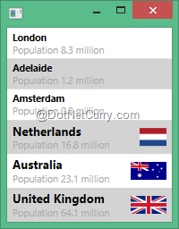
Figure 6: Our data grouped by place type
The GroupStyle property on ItemsControl allows us to control how groups are rendered. It’s important to realize that the property type is GroupStyle, not Style. The GroupStyle class defines a number of properties that we can use to control aspects of the group’s appearance.
The HeaderTemplate (and HeaderTemplateSelector) properties allow us to control what is rendered for each group’s header area, whereas the ContainerStyle and ContainerStyleSelector properties do the same for the container of each item within the group. We can also specify an AlternationCount like we did for ItemsControl, but this time each group is being assigned an AlternationIndex rather than the items within the group. The Panel property enables us to choose the layout panel that hosts the groups (we’ll be covering layout customization in a later section).
This is all very empowering, but let’s just try and display the name of each of our groups. We can do that by adding this within our ItemsControl definition:
<local:CustomItemsControl.GroupStyle>
    <GroupStyle>
        <GroupStyle.HeaderTemplate>
            <DataTemplate>
                <Border Padding="6" Background="DarkSlateGray">
                    <TextBlock
                        Text="{Binding Name}"
                        FontSize="14pt"
                        FontWeight="Bold"
                        Foreground="White"/>
                </Border>
            </DataTemplate>
        </GroupStyle.HeaderTemplate>
    </GroupStyle>
</local:CustomItemsControl.GroupStyle>
This results in Figure 7. If you’ve got an eye for design, you’re surely cringing right now. Sorry about that, but as you can see, we’ve successfully labeled each of our groups.
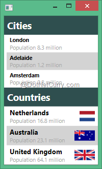
Figure 7: Headers for our groups
We can take things a lot further with GroupStyle. For example, by tweaking the ContainerStyle and HeaderTemplate, I was quickly able to come up with Figure 8. Of course, I chose a fresh palette and tweaked the font as well, but you get the idea.
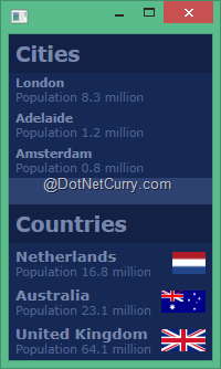
Figure 8: A visually tweaked version of our grouped data
ItemsControl also includes a GroupStyleSelector property, which offers us the now familiar flexibility to dynamically select a GroupStyle instead of hard-wiring one. And, as a final note, it has an IsGrouping property, which tells you whether data is grouped or not. This might be useful when authoring control templates because one can trigger different visuals according to whether data is being grouped or not.
Adjusting Item Layout
To this point, the items within our ItemsControl have always been stacked one above the other. That’s certainly the most common way of laying out lists of items, but it’s not the only way. And if you consider the fact that ItemsControl is designed to be used in a wide variety of scenarios, one begins to suspect there must be a way to influence the layout of items. And indeed there is.
By default, ItemsControl hosts its items within a StackPanel with a vertical orientation. If you were paying careful attention, you may have noticed this within the WPF Visualizer (see Figure 4, for example). The container for each item within the ItemsControl is added, in order, to this panel. That explains the vertical stacking we’ve seen up until now.
But the ItemsPanel property on ItemsControl allows us to provide our own panel in which items will be hosted. More accurately, it allows us to specify a template with which to produce the panel. Suppose, for example, we want to lay out our places horizontally rather than vertically. To achieve this, we can write the following XAML:
<local:CustomItemsControl …>
    <local:CustomItemsControl.ItemsPanel>
        <ItemsPanelTemplate>
            <StackPanel Orientation="Horizontal"/>
        </ItemsPanelTemplate>
    </local:CustomItemsControl.ItemsPanel>
    …
Things are a bit verbose here due to our custom ItemsControl. Without such customization, it would look more like this:
<ItemsControl …>
    <ItemsControl.ItemsPanel>
        <ItemsPanelTemplate>
            <StackPanel Orientation="Horizontal"/>
        </ItemsPanelTemplate>
    </ItemsControl.ItemsPanel>
    …
In any case, what we end up with is depicted in Figure 9. Notice how our items now run left to right. In other words, they’re stacked horizontally rather than vertically. You can also see that each group of items has its own panel. That explains why we supply a template for the panel rather than the panel itself: the ItemsControl needs to be able to dynamically create these panels at whim to accommodate the addition of new groups.
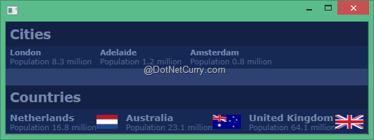
Figure 9: Our ItemsControl with a horizontally-oriented StackPanel
Of course, we don’t even have to use a StackPanel. Any Panel will do, though some are less suited to situations where there could be any number of children added to them. What if we wanted two equally wide columns of data? We can do that with a UniformGrid:
<ItemsPanelTemplate>
    <UniformGrid Columns="2"/>
</ItemsPanelTemplate>
This gives us Figure 10. Or we could lay out items such that they automatically wrap when there is insufficient space remaining on the current row:
<ItemsPanelTemplate>
    <WrapPanel Orientation="Horizontal"/>
</ItemsPanelTemplate>
This gives us Figure 11. Notice how the items in our groups adapt to the available space. If they fit, they will be displayed left to right. If there is no more space left, they wrap to the next line. We can also control how groups are laid out by assigning an ItemsPanelTemplate instance to the Panel property on GroupStyle. The principals are exactly the same as when laying out items within the group, but the panel will instead lay out the groups themselves.
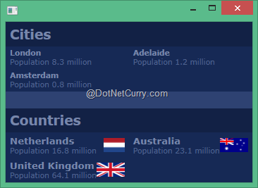
Figure 10: Laying out items in two columns by using a UniformGrid
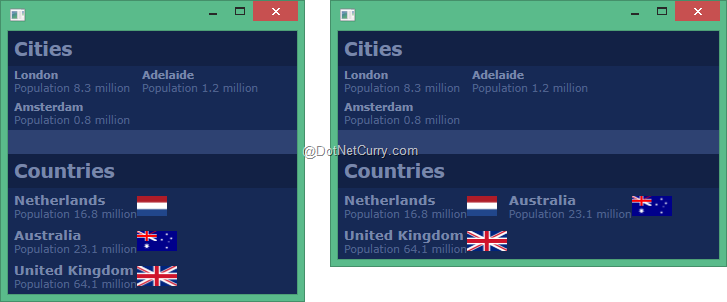
Figure 11: Wrapping items according to the available space
We can take this a lot further. What if we wanted to display each item on a world map? The first thing we’ll need is the longitude and latitude for each place. To that end, we can simply add the appropriate properties to our PlaceViewModel and populate those properties using google as an aid. For example, here’s the new constructor invocation for London:
new CityViewModel(
    "London",
    8.308f,
    -0.1275,
    51.5072),
Notice the final two arguments. They are London’s longitude and latitude.
Next, we need to display a map. I found a free Mercator-projected SVG online and exported it to a PNG using Inkscape https://inkscape.org/. But displaying the PNG is a little less obvious. We could either re-template our ItemsControl so that the map image is part of its visual tree, or we could simply put the map image along with the ItemsControl into the same Grid. In a real application I’d probably go the more formalized route, but for simplicity, I chose the latter approach for this article:
<Grid>
    <Image …/>
    <local:CustomItemsControl …
Now our map image will display behind our ItemsControl, but our ItemsControl will essentially block out the image. We know we’re going to need fine-grained control over the coordinates of our items so that we can use the longitude and latitude of the item to position it on the map. We could write our own Mercator projection panel here, and again this is a route I would consider for a real application. But for illustration purposes, I chose to simply use a Canvas as the panel for our ItemsControl:
<ItemsPanelTemplate>
    <Canvas/>
</ItemsPanelTemplate>
Now we can position our items absolutely using the attached properties that Canvas provides us:
<local:CustomItemsControl.ItemContainerStyle>
    <Style TargetType="ContentControl">
        <Setter Property="Canvas.Left">
            <Setter.Value>
                <MultiBinding Converter="{StaticResource LongitudeConverter}">
                    <Binding ElementName="image" Path="ActualWidth"/>
                    <Binding Path="Longitude"/>
                </MultiBinding>
            </Setter.Value>
        </Setter>
        <Setter Property="Canvas.Top">
            <Setter.Value>
                <MultiBinding Converter="{StaticResource LatitudeConverter}">
                    <Binding ElementName="image" Path="ActualWidth"/>
                    <Binding ElementName="image" Path="ActualHeight"/>
                    <Binding Path="Latitude"/>
                </MultiBinding>
            </Setter.Value>
        </Setter>
Rather than going into the details of the converters, I’ll leave it as an exercise for the reader to investigate how to convert longitudes and latitudes to X and Y locations in a Mercator projection. It’s just some simple math.
Lastly, I tweaked the item templates so that countries just display their flag and cities display small red dots. The end result is shown in Figure 12.
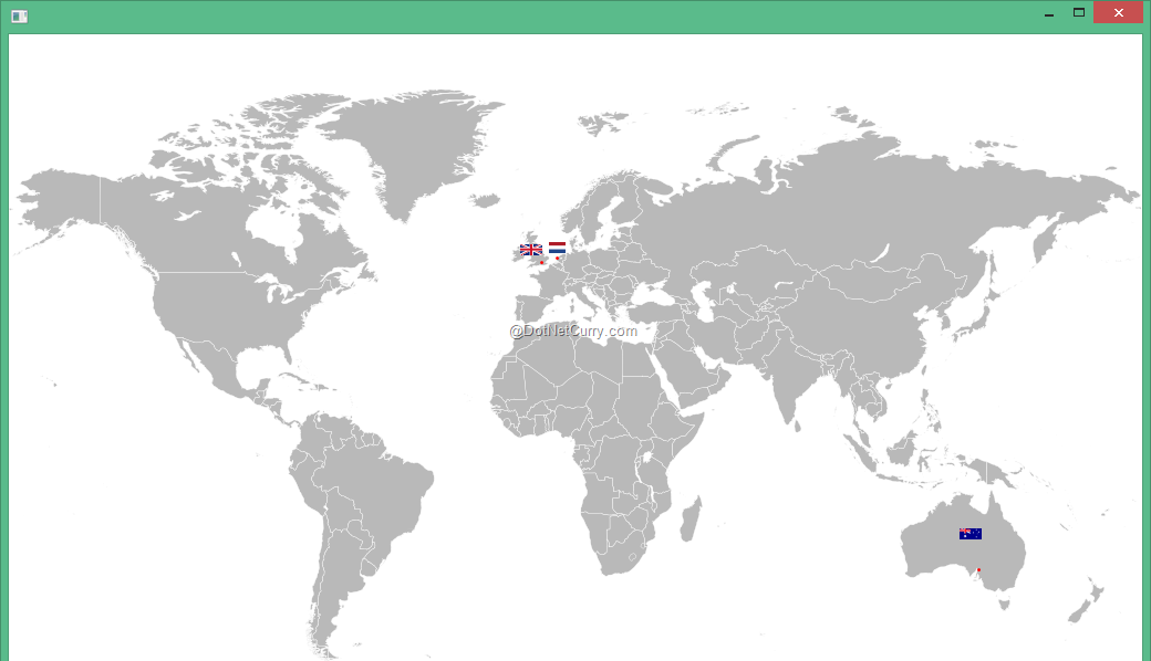
Figure 12: Our items displayed on top of a map
That’s a significantly different visualization of the same data, but still utilizing an ItemsControl. But what if we want the user to be able to select a place? Looking through the properties of ItemsControl you may be disappointed to see nothing to help with selection. But that’s where ItemsControl subclasses come into play.
ItemsControl Subclasses
Having a firm grasp on all the ItemsControl concepts and features we’ve talked about thus far will be invaluable when you need to utilize other list-like controls. Many WPF controls – ListBox, ComboBox, TabControl, TreeView, Menu, StatusBar, and more – all inherit from ItemsControl. So in effect you already know how to populate a Menu, modify the appearance of the StatusBar, or group items in a ListBox.
Of course, the ItemsControl subclasses do add functionality and behavior according to the problems they’re solving. It’s too great a task to cover every piece of behavior added by every ItemsControl subclass, but we’re going to close out this article by discussing a few of them.
Selection
One glaring omission from ItemsControl is the concept of selection. We have no way of telling an ItemsControl that a certain item is selected, or how to render a selected item. We could concoct our own solution to this – perhaps with an attached IsSelected property and some triggers in our XAML. But the concept of item selection is so frequently required that it is built into WPF, so we’d be wasting our time.
ItemsControl subclasses such as ListBox and ComboBox support selection via an intermediate abstract class called Selector. The Selector class gives us a number of selection-related properties to track and modify the currently selected items.
As a first step towards adding selection support to our map of places, we can swap out our custom ItemsControl subclass for a ListBox. Because of our highly customized UI, we could equally have used a ComboBox. When using the standard control templates, the choice between these two controls is clearer. The ListBox displays all its items in a list, whereas the ComboBox shows only the selected item by default, but can display a list if the user requests it. The ComboBox also optionally allows direct text entry (hence the name – it is a combination of both a list, and text entry control).
Nothing much changes in our XAML apart from tweaking the ItemContainerStyle to target ListBoxItem, which is the container type that ListBox wraps each item in. We also have to specify a transparent background for our ListBox because otherwise our map image won’t show through. Once we’ve made those small changes, we wind up with Figure 12 again, only this time our items can be selected by clicking on them (which can again be verified via the WPF Visualizer). The trouble is, we’ve provided a custom template for the ListBoxItem instances, and that template does not include any visual changes for selected items.
To rectify this, we can modify our ListBoxItem template as follows:
<Setter Property="Template">
    <Setter.Value>
        <ControlTemplate TargetType="ListBoxItem">
            <Border x:Name="border" BorderThickness="1" Padding="3">
                <ContentPresenter/>
            </Border>

            <ControlTemplate.Triggers>
                <Trigger Property="IsSelected" Value="True">
                    <Setter
                        TargetName="border"
                        Property="BorderBrush"
                        Value="#FF60AFFF"/>
                    <Setter
                        TargetName="border"
                        Property="Background"
                        Value="#8060AFFF"/>
                </Trigger>
            </ControlTemplate.Triggers>
        </ControlTemplate>
    </Setter.Value>
</Setter>
Naturally, there are many ways we could depict selection, but here I have chosen to display a simple blue border around the selected item. Figure 13 shows the result, where Australia has been selected.
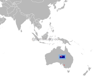
Figure 13: Depicting selection with a blue border
Scrolling
If we add more places to our data and revert to displaying our items in a list instead of on a map, we’ll find that the ItemsControl does not intrinsically support scrolling. That is, we’ll wind up either having to give our ItemsControl more space, or items will get cut off and the user will have no way of viewing them.
To illustrate this, take a look at Figure 14. On the left is an ItemsControl and on the right, a ListBox. Both controls are bound to the same data – a list of countries. Notice how the ListBox is scrollable (indeed, I have scrolled about a third of the way through the list) whereas the ItemsControl only shows the first 20 or so items with the rest out of view.
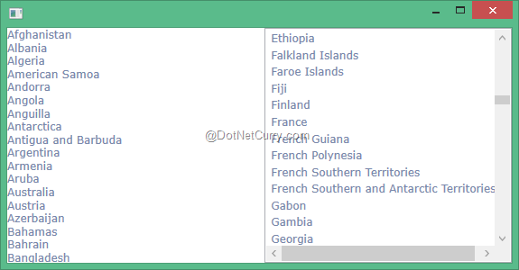
Figure 14: An ItemsControl (left) and ListBox (right) bound to the same data
It’s interesting to note that this is not a limitation of ItemsControl itself, but rather of the default template for ItemsControl. It’s entirely possible to re-template ItemsControl to include a ScrollViewer, thus allowing users to scroll through the items within. If we modify the ItemsControl template as follows:
<ItemsControl.Template>
    <ControlTemplate TargetType="ItemsControl">
        <ScrollViewer>
            <ItemsPresenter/>
        </ScrollViewer>
    </ControlTemplate>
</ItemsControl.Template>
We are now able to scroll through the items within the ItemsControl, per Figure 15. However, subclasses of ItemsControl typically do this for us because they’re specifically designed to be used in such scenarios. In addition to that, they often enable UI virtualization.
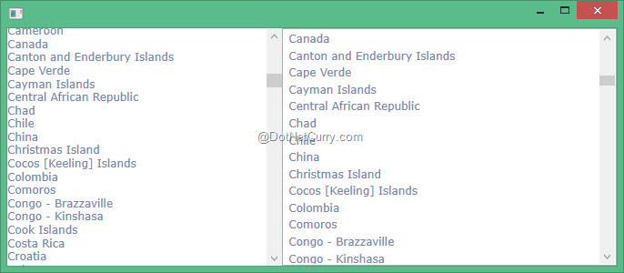
Figure 15: Enabling scrolling in ItemsControl via a custom template
UI Virtualization
The idea of UI virtualization, at least in the context of ItemsControl, is to pool and re-use item containers. As the user scrolls through items, the containers for those items that are moved out of view can be re-used to host those that are coming into view. This means the total number of containers required to display the view is kept to a minimum, and less cruft is created for the garbage collector to clean up.
By default, both the ListBox and ListView controls have UI virtualization enabled. It can be enabled on other controls too – even ItemsControl itself, assuming the template for the ItemsControl wraps the items in a ScrollViewer, as we did above.
The key to enabling UI virtualization on those controls that don’t enable it by default is to use a VirtualizingPanel for the ItemsPanel and set the IsVirtualizing property to true. There are some things you can do inadvertently that prevent UI virtualization, so beware. For example, adding items manually (as opposed to using data binding) and heterogeneous item containers (e.g. mixing MenuItem and Separator in the same Menu) will both silently disable UI virtualization.
Conclusion
The ItemsControl is a real workhorse in WPF and other XAML stacks. Its humble veneer could trick you into overlooking its power and flexibility. This two part article walked you through many aspects of the ItemsControl itself, such as populating data, customizing appearance, and adjusting layout. We then looked at features such as selection and scrolling, which are provided by subclasses of ItemsControl.
The detailed understanding of ItemsControl you now possess will change the way you think about many common UI problems. Solutions to previously intractable UI scenarios will become more evident to you, especially as you put to practice the techniques presented here.
Download the entire source code of this article
This article has been editorially reviewed by Suprotim Agarwal.
C# and .NET have been around for a very long time, but their constant growth means there’s always more to learn.
We at DotNetCurry are very excited to announce The Absolutely Awesome Book on C# and .NET. This is a 500 pages concise technical eBook available in PDF, ePub (iPad), and Mobi (Kindle).
Organized around concepts, this Book aims to provide a concise, yet solid foundation in C# and .NET, covering C# 6.0, C# 7.0 and .NET Core, with chapters on the latest .NET Core 3.0, .NET Standard and C# 8.0 (final release) too. Use these concepts to deepen your existing knowledge of C# and .NET, to have a solid grasp of the latest in C# and .NET OR to crack your next .NET Interview.
Click here to Explore the Table of Contents or Download Sample Chapters!
Was this article worth reading? Share it with fellow developers too. Thanks!
Kent Boogaart is a Microsoft MVP in Windows Platform Development since 2009. He lives in Adelaide, Australia with his wife and two kids. You can find his blog at
http://kent-boogaart.com and follow him on Twitter @kent_boogaart